- edge - SDI_IP Conversion and Routing Platform
- VSM - IP Broadcast Control System
- VSM - System Overview
- vsmStudio - User Manual
- vsmStudio - General Information
- vsmStudio - Installation and Update
- vsmStudio - Toolbar and Status Indicators
- vsmStudio - Communication Port Management
- vsmStudio - MultiServerCluster Redundancy
- vsmStudio - Configuration Settings
- vsmStudio - Layers
- vsmStudio - Master Matrix
- vsmStudio - Signal Paths
- vsmStudio - Pseudo Devices
- vsmStudio - Gadgets
- vsmStudio - Meta Gadgets
- vsmStudio - Storage Groups
- vsmStudio - Modules
- vsmStudio - Monitor Management
- vsmStudio - Explorer Directory
- vsmStudio - Tally Management
- vsmStudio - GPIO
- vsmStudio - Panel List & Panel Editor
- vsmStudio - Panel Editor 1 - The Panel List
- vsmStudio - Panel Editor 2 - Panel Properties
- vsmStudio - Panel Editor 3 - Panel Layouts
- vsmStudio - Panel Editor 4 - Working with Buttons
- vsmStudio - Panel Editor 5 - Panel Pages
- vsmStudio - Panel Editor 6 - Button Functions
- vsmStudio - Panel Editor 7 - Button Properties
- vsmStudio - Views
- vsmStudio - UMD
- vsmStudio - Timers
- vsmStudio - Image Map
- vsmStudio - HowTo Configuration Details
- vsmGear - User Manual
- vsmGadgetServer - User Manual
- vsmPanel Client - User Manual
- vsmWebPanel Client - User Manual
- vsmSnap - User Manual
- vSNMP - User Manual
- VSM - Interface, Driver and Application Details
- VSM - Data and IT Specifications
- VSM - Help Center
- HOME - Media Infrastructure Management
- Radio - Audio and Broadcast Applications
- Audio Production - mc² Mixing Consoles
- Lawo Support and Care4 SLA
- Lawo - General Information
vsmStudio - Panel Editor 6 - Button Functions
Panel Toolbox
Once you add a page to your panel layout, you can start adding key functionality. Via the panel toolbox, you have access to the available key functionalities in vsmStudio. It opens automatically with the panel edit view. Depending which panel edit mode is active, the panel toolbox opens with different active keys.
In layout edit mode, the panel toolbox allows you to add or remove keys, define panels and virtual pages. When editing in page mode, all other keys are active.
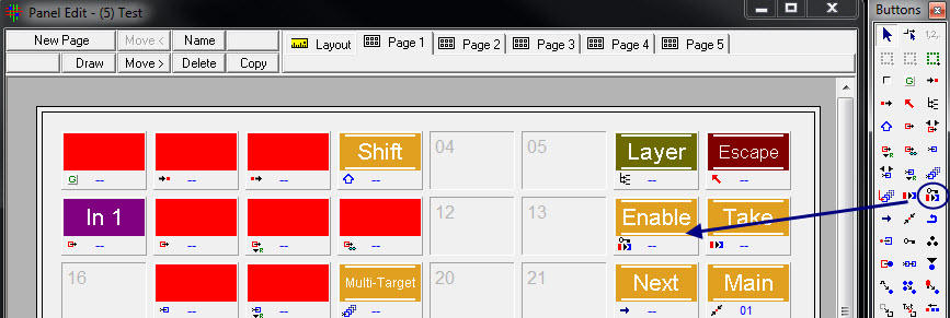
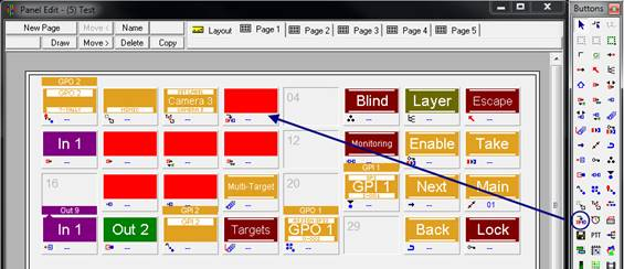
In the panel toolbox you can select the key function or page item you want to use with your panel page. To assign a functionality to a key, click the desired function from the buttons toolbox first. The function is now attached to the mouse cursor. When you move the cursor into a panel page, the attached functionality is indicated by a tiny icon close to the cursor. Now, click the key you want to assign with the specific functionality.
After you have assigned a functionality to a key, the function is detached from the cursor to avoid accidential multi-assignment.
If you want to assign the same key functionality to many keys without re-selecting it from the toolbox after each assignment, just press the space-bar during the assignment process. The attached functionality will remain available unless you release the space-bar.
Select Object
![]()
The cursor is used to select any button or button area object for editing. It is activated by default.
The select function does not manipulate the properties of a button in any way. Holding down the shift button while selecting various buttons will select multiple buttons and the last selected button becomes the reference.

Copying and Moving Buttons
![]()
Selecting this button will create a pointer “from”, which will change to "swap" once you click on any button. Click the button which should receive the copied function and it will receive it. Holding the shift key on your keyboard will change it to "copy"
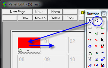
With the second arrow symbol, Move/Copy, previously created buttons can be moved on the panel or copied while holding the shift button.
Adding and Removing Buttons
![]()
This function is available when you are in the layout mode.

You can add an arbitrary number (1-2997) of buttons. Added buttons will be placed below the active panel area.
The delete last button will delete the button with the highest number.
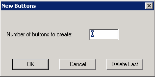
Please note: buttons are removed in order of their buttons IDs.
Define Virtual Pages
![]()
![]()
The symbol with the red framing indicates the function Define Virtual Pages. It is active when working in the layout mode. In the page edit mode, it is greyed out.
The function allows to define multiple individually controllable areas or groups on the same panel. You may use it to define areas within a panel, which allow for a navigation independent of the rest of the panel.
To define a virtual page, drag the red frame over the area of the control panel that is to be included in a group. Example: If you want to include key 1-16 into a virtual page, place the top-left corner of the frame beside the first key and drag the frame with the left mouse button pressed across all keys, until you reach the bottom-right key of the group. Release the mouse key.
Please note: only buttons that are entirely within the red frame will be Included in the virtual page. The selected area must therefore be bigger than the actual size of the buttons.
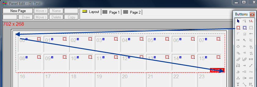
Virtual Panel Page
The maximum number of frames that can be created is 17.
Defining Sub Panels
![]()
![]()
The symbol with the blue framing indicates the function Define Sub Panels. It is active when working in the layout mode. In the page edit mode, it is greyed out.
With the Define Sub Panels function, a control panel layout view can be divided into several small panels. It is irrelevant whether the panel is a virtual or a physical panel. The function enables multi selection of sources and targets on the same panel as well as the selection of different pages.
To define a sub panel, drag a blue frame from top-left to bottom-right across all keys, which should be included in the panel.
Please note: only buttons that are entirely within the blue frame will be included in the sub panel. It is therefore recommended, to make the selected area bigger than the actual size of the buttons.

Sub panels
In the screenshot above, the button IDs 16 to 23 belong to sub panel 1, the button IDs 24 to 31 to sub panel 2. For each subsequent sub panel, the Define Sub Panel icon must be selected.
Grouping Elements
![]()
The green frame allows the grouping of elements. This function is applied to multiple GPIOs and allows to alternate the status of GPIOs (see GPIOs on Control Panels). If multiple GPI’s reside within the same group, only one can be set to true at any given time. Setting a GPI state to true will set all other GPI’s in the group to false.
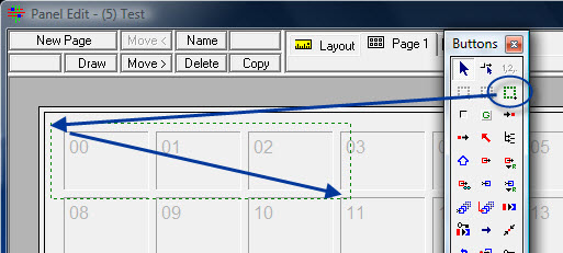
Grouping elements
To group elements, select the green frame in the panel toolbox and drag it around the relevant area on the control panel page while pressing the left mouse button.
Please note: only buttons that are entirely within the green frame will be included in the group. The selected area must therefore be bigger than the actual size of the buttons.
In the example above, the button IDs 00 to 02 belong to the group element. To create any other frames, the Group Elements icon must be reselected.
Blank
Generic Button
![]()
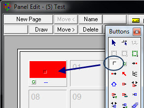
The Generic button, indicated by the G (for "Generic") in the toolbox, can be used universally, meaning that various labels and functions can be assigned to it. To do so, simply select the icon in the panel toolbox and place the function onto the relevant button by left clicking on an empty space. The cursor will show a small, green G at its tip while doing so.

Generic button
The function remains selected after having been assigned to a key, so that multiple generic buttons can be placed in quick succession. They are displayed in red in the panel edit as long as no function is assigned to them or if they aren't labelled.
It is, for example, possible to assign the function to the generic button that makes it jump to other panel pages. To assign this page, select the two, blue lines located in the bottom centre of the button.
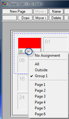
Page and group assignment
No assignment is the default state. This option can also be used to reset pages and groups that were previously assigned. If no groups were created on the panel, the options All and Outside become visible and are automatically checked. As soon as a group is created on the panel, it will be shown in the same drop down menu. Moreover, all available panel pages are listed here. By selecting one of them, the generic button will jump to that page, indicated by a small number on the button.
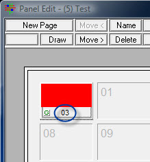
Generic button with page reference
Display Source
![]()
Using the function Display Source, the current source can be displayed. The number of Display Source buttons per panel page is not limited. If no other function was assigned to a button, it will be shown in red in the panel edit.

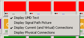
Display UMD Text: The option Display UMD Text, which causes input and output signals to be displayed on the button, is ticked by default.

Display Signal Path Picture: By clicking on Display Signal Path Picture, the primary label or a created signal path image of the relevant signal path will be shown, depending on its configuration.

Display Current (and Virtual) Connections: With Display Current (and Virtual) Connections, all signals are displayed. It is also ticked by default.
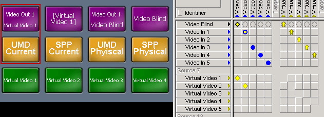
Display Physical Connections: If Display Physical Connections is selected, only physical signals will be displayed.
Display Target
![]()
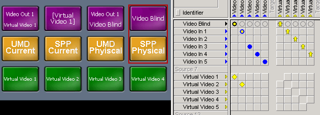
The Display Target button has the same function for targets as the Display Source button for sources. Therefore, the button shows which target is currently connected to a source. As with the Display Source button, the number of Display Target buttons per panel page is not limited, and the buttons will be shown in red in the panel edit if no other function is assigned to them.

Display Source buttons
A click on the bottom left of the Display Target button will open a menu offering the same functions as the Display Source button described above (see Display Source).
Escape
![]()
By clicking the Escape key, two functions are exectued: deselecting a button and jumping back to the first page. To add an Escape button to a panel page, select the symbol in the panel toolbox and then click the button. A small Escape icon will be shown to the left above the cursor. The number of Escape buttons per panel is not limited.

Escape button
The standard colouring for the Escape button is dark red with a white Escape label.
Layer
![]()
The Layer function can be used to deactivate certain layers. For instance, if switches connected to Pseudo Devices are made, it can be used to deactivate the audio component, thereby ensuring that switches are only made on the video layer.

Layer button
This button is normally displayed in olive-green with the caption Layer in white lettering. Within the Style tab of the Properties, it is possible to change the on-screen and LBPxx Color.
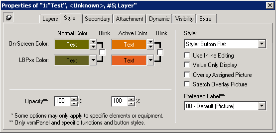
The Layers tab allows you to choose which layers should be deactivated. It is possible to deactivate only one or more layers at once.
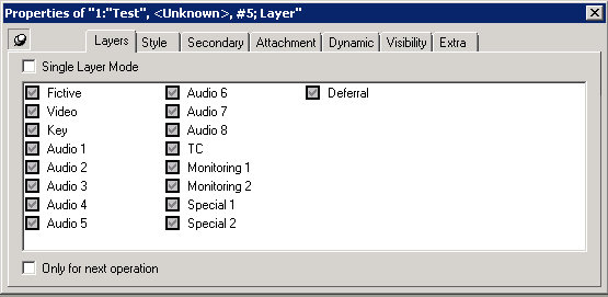
By default the check boxes left of the layers are greyed out and contain a check mark. The checkboxes can have three status:
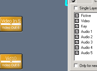
Greyed out check boxes indicate that the Layer button is inactive and is not observable on a virtual panel.
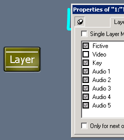
An empty checkbox will activate the Layer button functionality and the button is observable on a virtual Panel. In order to deactivate a layer (e.g. Video) you need to press the Layer button. It will change its colour to orange and deactivate the layer Video. So, when the Layer button is active these Layers are deactivated
A check mark in the check box indicates that this layer is permantly active while other Layers are off. If you activate the Layers button only the checked Layers will be activated.
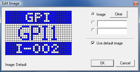
It is possible to create Bitmaps for Layer buttons in default mode.
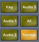
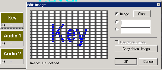
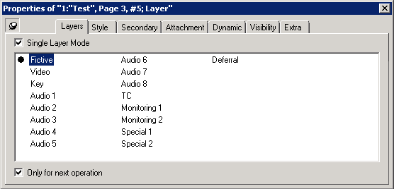
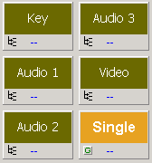
In Single Layer Mode it is possible to choose single layers that should be deactivated when the Layer button is active. Once selected the name of the layer to be deactivated is displayes automatically on the layer button. It is possible to create a Bitmap for this Layer button but it is not displayed on a virtual or LB Panel.
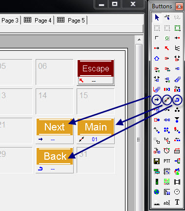
Next, Main and Back
Shift
![]()
The Shift button, while pressed, will jump to a specific page that needs to be defined prior to using the function. On that page, it may be possible to execute switches or view the status of a switch. Upon releasing the Shift button, it will jump back to the previous page.

Shift button
The default colouring for the Shift button is a light orange with the caption Shift in white.
On vsmPanel the shifted page will stay when a target or source is selected.
Source
![]()
A Source button is created as soon as a source signal is placed on the panel or a state is to be displayed through DAS. Moreover, if, for example, the target of a loop-through device was placed on a panel instead of the source, this error can subsequently be corrected using this button.
Please note: this only applies to loop-through devices, not to standard signal paths.
Buttons with only the Source function are displayed in red in the panel edit.

Source and source signal buttons
If a source signal is placed on a panel from the signal path list, the signal path name will appear on a purple background. This colour is predefined for source signal paths and cannot be changed.
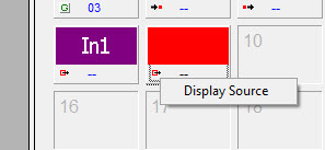
Display source options
A left-click onto the small source icon on the button will open a menu with the option Display Source. Used together with DAS, it is possible to view the input signal that corresponds to the selected output signal.
Target
![]()
The Target button is created as soon as a target signal is placed on the panel or a state is to be displayed through DAS. Moreover, if, for example, the source of a loop-through device was placed on a panel instead of the target, this error can subsequently be corrected using this button.
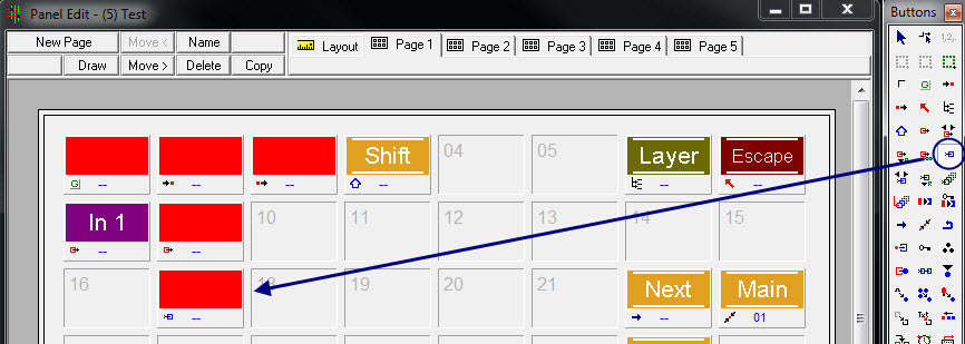
Target button
This button is the equivalent of the Source button for targets.
By default the Identifier is displayed.
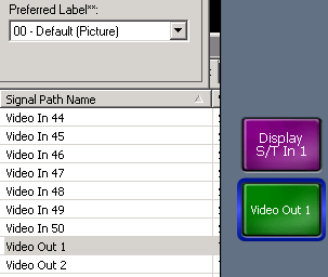
As soon as you enter a Primary Label it is displayed on the source button automatically, although '00-Default (Picture)' is selected as the Preferred Label. It is displayed in big letters like a SPP.

Choosing '01-Primary' as Preferred Label displays the Primary label in smaller letters.

Choosing any other label as Preferred Label will be displayed in the Source button.
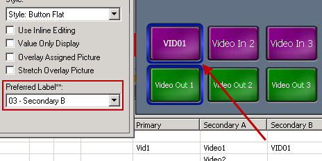
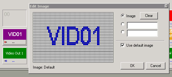
You can also create a Signal Path Picture for a Source button. Preferred Label must be set to '00-Default (Picture)' in order to display the SPP on the virtual Panel.
Target button options
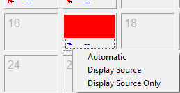
Selecting the Target icon in the bottom left of the button, a menu with the following three options will open: Automatic, Display Source, and Display Source Only. If Automatic is chosen, this target will always be selected. Display Source will display the currently selected target and the source connected to it on the button. With Display Source Only, the currently connected source of the selected target will be shown on the button.
Rotate Source and Target
![]()
![]()
Using the Rotate Source and Target buttons it is possible to navigate through a list of sources or targets by creating just three buttons. Before, you need to create a view in your View List with the inputs and outputs you want to navigate.
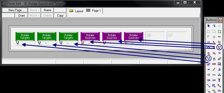
Rotate Source and Target
Therefore, create three Rotate Source and three Rotate Target buttons. By the way it is possible to use more buttons.
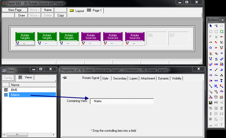
Containing View
The next step is to drag and drop your desired view into the button properties under the tab Rotate Signal. It is sufficient to drag and drop the view only on one target and source, respectively.

Navigation Arrow vsmPanel
In the vsmPanel you will see that you can navigate now between sources and targets with the navigation buttons on both ends.

When you reach the beginning or the end the navigation button dimmes its color to grey. Select and hold the left navigation button will jump to the first page.

Crosspoint vsmPanel
Pressing on a source and target button will set and crosspoint between them.
Reference Source
![]()
The button Reference Source allows the use of one signal as a reference to refer to multiple sub groups.

Reference Source button
The Reference Source button can be placed on multiple panels with one assignment. It is therefore sufficient to place the reference signal on only one panel.
You can assign a signal to a reference group which will be displayed on every Panel with the same reference group. Don't forget to refresh vsmPanel after changes.
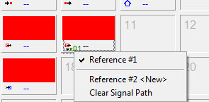
Assigning a reference
By selecting Reference #1 after left-clicking on the small icon in the bottom left of the button, a first reference group can be created. The signal In1 is, for example, assigned to it. After the first reference group has been created, the option Reference #2 <New> automatically appears. By selecting Reference #2 <New>, a second group will be created, to which the signal In 2 could, for example, be assigned. Clear Signal Path will reset the signal assignment of a reference group, so that a new signal can be added. Alternatively another source can be drag and dropped on the button.
Reference Target
![]()
The button Reference Target is the equivalent of the Reference Source button for targets. With this button, it is therefore possible to refer to multiple sub groups from one reference output signal. The Reference Target button can be distributed to multiple panels with one single assignment. It is therefore sufficient to place the reference signal on one panel.
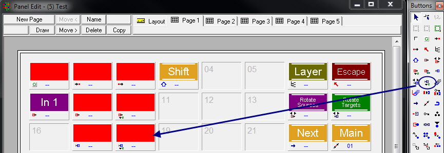
Reference Target button
For the assignment of reference groups, the same options are available as those described for the Reference Source button (see Reference Source).
It is possible to route using Reference Source and Target buttons!
Preview
Multi Target
![]()
Using the Multi Target button, multiple targets can be selected and the sources connected to them can be viewed on a LPB. On a virtual Panel only the Target is displayed. Furthermore, it is possible to select multiple targets and connect one specific source to them.
This button is generally displayed in light orange with the label Multi Target in white lettering. It is possible to create individual Bitmaps.
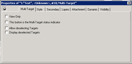
The following attributes are set on every Multi-Target button the same time. This button is the Multi-Target status indicator is the only exception.
View Only: With View Only, the button functions only as a display button. Selected Targets are displayed in a bright yellow. Deselected Targets are greyed out with white lettering on a virtual Panel. On a LBP there is nothing to see.
This button is the Multi-Target status indicator: With the checkmark before This button is the Multi-Target status indicator, this button can activate or deactivate the multi target function. The active colour indicates, whether the function is active or not. There can only be one Multi-Target button with this attribute checked.
Allow deselecting Targets: With Allow deselecting Targets, selected output signals can be deselected at a later point in time. Deselected Targets are greyed out as in the pictures above.
Display deselected Targets: With the checkmark before Display deselected Targets, deselected output signals will still be displayed with an orange background. If the box is not ticked, these buttons are greyed out in the vsmPanel software.
When more Targets are selected than Multi Target buttons are available, the first and last button become navigation buttons.

Multi Target from Source
![]()
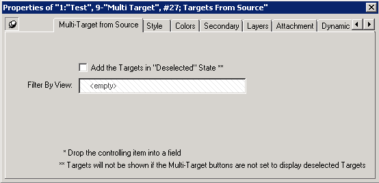
The Multi Target from Source function allows you to display the Targets connected to a certain Source. Press the Multiple Target from Source button and select a Source --> The connected Targets will be displayed in a blue circle.
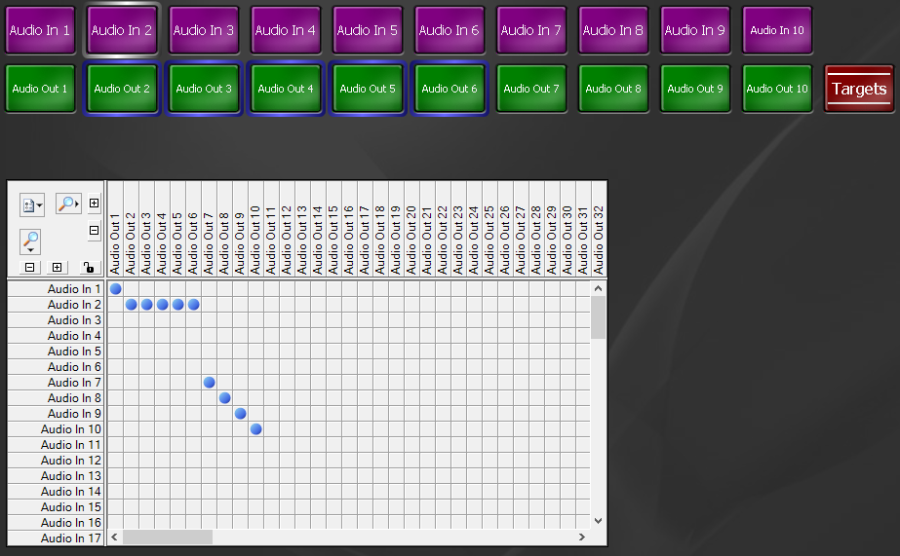
While the Target from Source button is active the Sources can be selected. Sources that are not connected to a Target are greyed out.
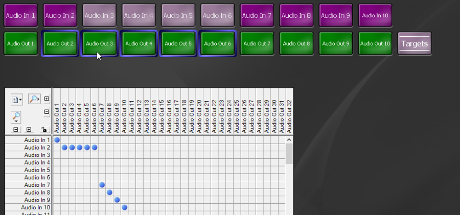
The Multiple Target and Target from Source button can be used together.
Take
![]()
If a Take button is used on a control panel, all switches must be separately executed via this button. Therefore, switches are only executed after the source, the target, and the Take button have been selected. It serves as a confirmation button.

The default colouring for this button is the caption Take in white lettering on a light orange background.
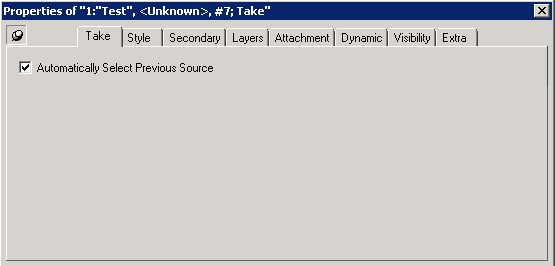
Automatically Select Previous Source: Will select automatically the previous source after a switch. It can be used to toggle between two sources.
Enable
Source of Target
![]()
The function Source of Target can be used to display the source of the currently selected target.
Here is how to use the function:
- create a Target button on the panel.
- place the Source of Target function on the same button.
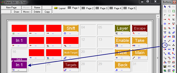
In the Panel Editor the button will then show both the target – for example Out 9 – and the corresponding source, for instance In1. It is also possible to execute direct switches with this button.
After clicking the Source of Target icon in the bottom left of the button, the following menu opens:
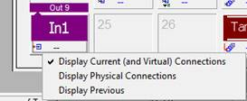
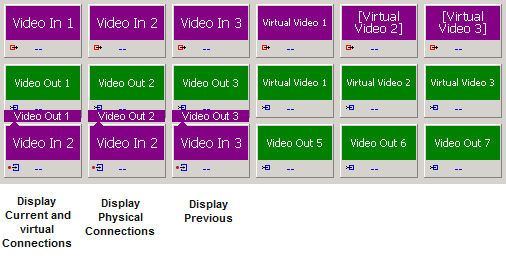
- Display Current (and Virtual) Connections is the default selection and causes all signals to be displayed.
- Display Physical Connections will only display physical signals
- Display Previous will show the signal that was last switched onto the target.
Target of Source
![]()
The Target of Source function is the equivalent of the Source of Target function for targets. It can be used to display the target of the currently selected source.
- place a Source button on a panel
- then Target of Source function on the same button.
The button no longer shows the source but the target, for example Out2. Direct switches are also possible with this button.
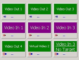
Lock Target
![]()
The Lock Target function is used to lock a target from accidential overwriting by other operators. Drag the function to an empty button on a panel to use it.
To apply a "lock" to a target, select a target and then hit the "lock target" key. The locked target will indicate its "lock" state within the key.
Various options are available for the Lock Target function:
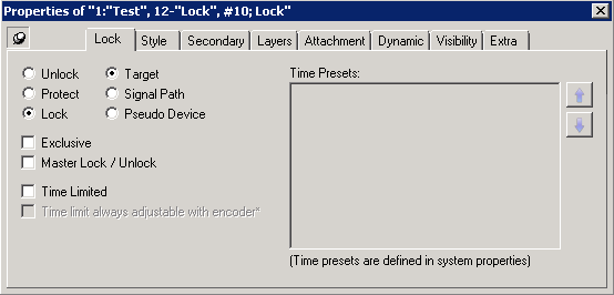
Unlock: If Unlock is selected, the button can only be used as unlock button. In order to unlock a target locked by another instance,e.g. another lock button from another panel, Master Lock/Unlock must be checked.
Protect: If Protect is selected, the target, on which the protection is applied on, remains switchable on the local panel, while it becomes protected from other panels or the matrix view. This is indicated in the matrix view by a red dot and a padlock in the respective column. On the panel the protected target gets the additional label ‘LOCKED’. After protecting targets, the protect button turns into an ‘Unlock’ button
Lock: If ‘Locked’ is selected, has the same effect as ‘protect’, but can now also not be switched from the panel, before it is unlocked again. Every panel can individually lock a target. The option master lock/unlock is primary a “master unlock” more than an master lock when not used in exclusive mode
Exclusive: If ‘Exclusive’ is checked, the additional ‘LOCKED’ label, that is shown on every representation of a source among all panels, as long as the source is locked, turns into ‘L=<panel ID>’ (whereby <panel ID> is the ID of the panel, on which the button was locked)
Master Lock/Unlock:Master Lock/Unlock will make the button usable as either lock or unlock button for the currently selected output. It can reset all previously set lock commands
Time Limited: Time limited locks will lock Targets/Signal Paths/Pseudo Devices for a certain time period. When selected it is possible to choose one of the Time Presets on the right side. The Time presets can be created within the Matrix Properties under 'Timed Locks'.
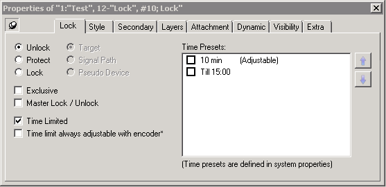

It is possible to select more than one time preset. On a virtual Panel you can switch between the time presets by pressing the lock button. Hold down a Timed Lock button for 500ms unlocks the selected target.
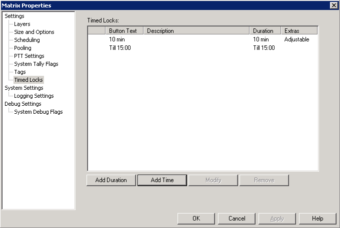
- Time limit always adjustable with encoder: When activated it is possible to manipulate the time limit using an encoder of a hardware panel. When this option is deactivated it is also possible to manipulate the time limit as long as the Time Preset has the general attribute 'Adjustable' set. When locking a button, it starts at – (1 min. + rest of the current minute on the clock). So the target lock always ends at the end of a minute on clock (e.g. you lock a button at 13:45:25, the button lock timer for 1 Minute will start at -1:35).
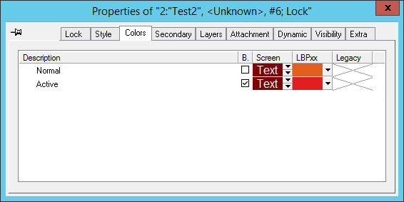
The default colors for a "Lock Target" key is shown in the image below.
If you have selected Where possible let vsmPanel render labels in the properties of the panel you are working with, a locked target will display like this:

Blind Source
![]()
The Blind Source function can be used to switch selected targets onto a pre-defined blind source.

Blind button
The default colour theme for this button is the caption Blind in white lettering on a dark red background.
Connect Targets
![]()
Using the Connect Targets function, a target can be changed into a source. Therefore you need to create a "loop-through" device.

Connect Targets button
By default, it is displayed with the caption Connect Targets in white lettering on a dark red background.
- Place the Target of the loop-through device on a panel
- Select another target.
- Now click on the Connect Targets button.
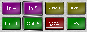
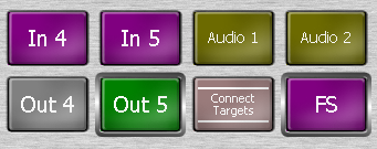
The loop-through target will turn into its source and you can connect it with another target.
Control Button
![]()
The button Control, e.g. GPIs, Gadgets... is used for functions, such as GPIOs and gadgets.
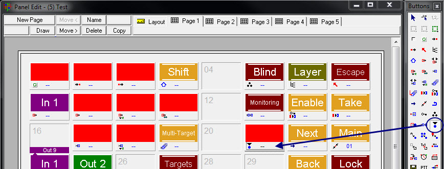
Control button
Gadget Control
If the value placed on the control button is a gadget, the following window will open by left-clicking on the icon in the bottom left of the button:
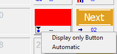
Control button options for gadgets
The first option changes the placed button into a display button. A gadget parameter can therefore be displayed but not edited. Selecting Automatic will automatically select the placed gadget, allowing the value to be changed directly on the control panel using an encoder.
GPIO Control
If the value placed on the control button is a GPIO, a left-click onto the icon in the bottom left of the button will open the following window:
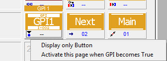
Control button options for GPIOs
The first option changes the placed button into a display button. A GPIO can therefore be displayed but not edited. If Activate this page when GPI becomes true is selected, the panel page on which the GPIO is located will be called up as soon as the GPIO is set.
Button Properties
If a control button is placed on a panel, a new tab, Control, appears in the properties window:
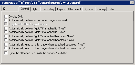
- Display Only: When this box is ticked, the button only serves as display button.
- Automatically perform action when page is entered: This option allows the execution of a function placed on the panel as soon as the page on which the button is located is opened. (Works only for one control button on each page. Other checked button are ignored)
- Toggle with "Blind" signal source: This option allows a crosspoint button to jump between the crosspoint placed on the panel and the blind source.
- Automatically perform "goto" if attached is "True": Allows a page change as soon as the function on the panel is active.
- Automatically perform "goto" if attached is "False": Allows the same automatic page change if the function is inactive.
- Automatically perform "goto" if attached becomes "True": An automatic page change will occur as soon as the function on the panel becomes active.
- Automatically perform "goto" if attached becomes "False" : Prompts the same automatic page change as soon as the function on the panel becomes inactive.
- Automatically jump to "this" page when attached becomes "True": This option also enables an automatic page change. If, for instance, a GPO lies on a panel page and becomes active, the program will open the page on which the GPO was placed.
- Automatically jump to "this" page when attached becomes "False" is exactly the same function for an inactive GPO.
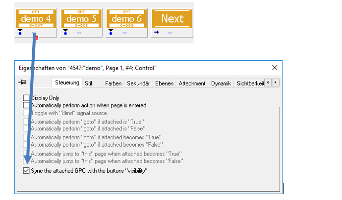
- Sync the attached GPO with the buttons “visibility”: If this function is checked, the GPO attached to that button is set as soon as the page containing this button is entered. It is cleared as soon as the page is left. If the respective page is visited and the GPO is active it can manually be switched at all times via the button, but will anyway be cleared as soon as the page is left. It is reset when the page is revisited. However, the GPO state is not affected by the button's visibility on the page (e.g. when the buttons visibility is controlled by another event via the visibility tab in the button's properties).
Page 1:

Page 2:

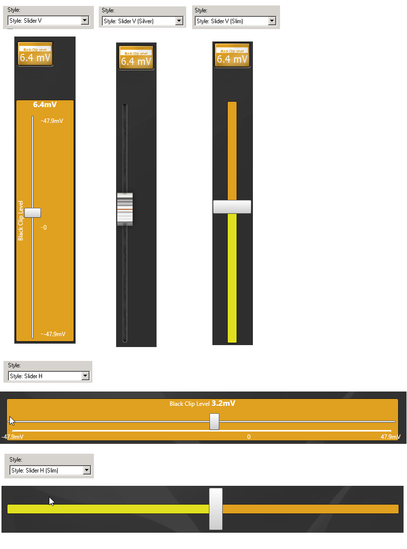
Integer Gadgets contain numeric values. They can be placed as a normal button on the Panel, but you will not be able to change the values. Change the button into a slider to be able to directly apply changes.
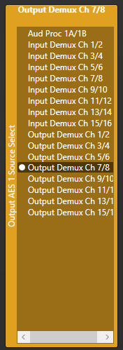
Enumeration Gadgets contain several entries which can be chosen. This can be displayed in a list function.
Assign GPI-I/O to Switchable Node
![]()
Using the function Assign GPI to Switchable Node, a crosspoint switch can be assigned to a GPIO.
- Place the relevant GPIO on a control panel button
- Then, assign the function Assign GPI to Switchable Node to the same button.

GPI crosspoint assignment
The default colouring before a GPIO is placed on it is the caption GPIO in white lettering on a light orange background.

As soon as a GPIO is placed on it, the caption changes to the GPIO's name.

To assign a switch able node click on the Assign GPI-I/O to switchable node button. It will start to blink yellow/grey. Now click on a target and source, which should be assigned. The source and target will then be displayed in the button and stops blinking.
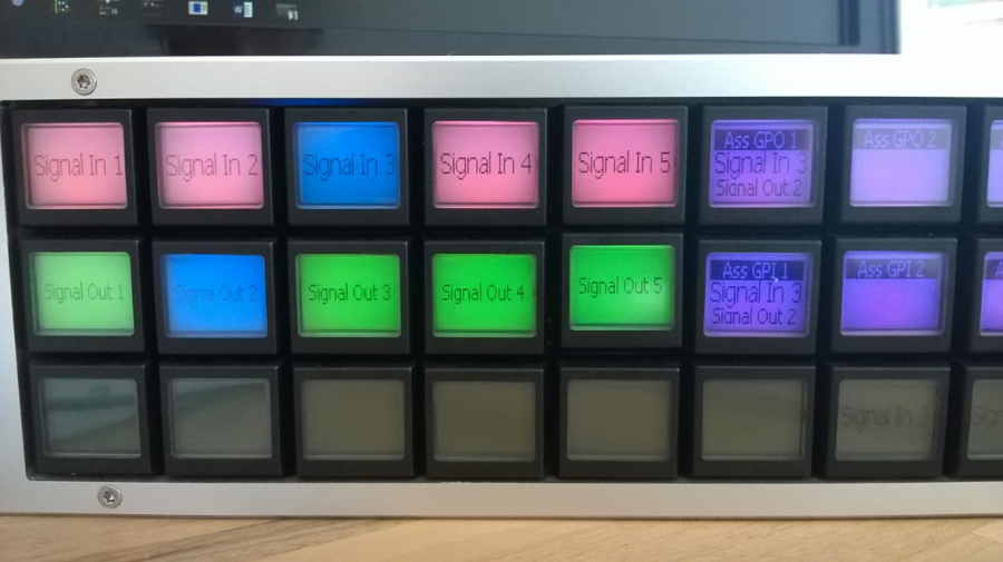
As soon as the GPI-I/O gets active the crosspoint will be set.
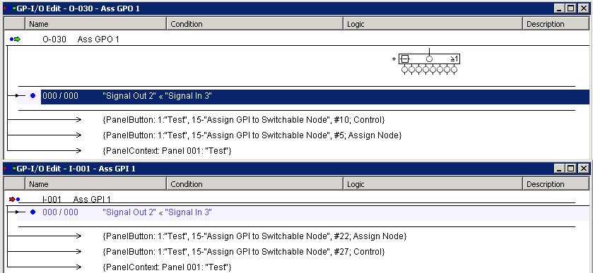
In order to remove the assignment click on the Assign GPI-I/O to switchable node until it starts to blink. Then click again and the assignment will be removed.
Assign Multiple GPIs/GPOs to GPO
![]()
With the function Assign Multiple GPIs to GPO, multiple GPIs but also GPOs can be linked to one GPO.
- A GPO is placed on a control panel button
- Then, assign the function Assign Multiple GPIs to GPO to the same button. You can also assign the function Assign Multiple GPIs to GPO first and then attach a GPO afterwards.
It is not allowed to attach a GPI.

GPI-GPO Assignment
Before a GPI is placed on this button, its default colouring is the caption GP-O? in white lettering on a light orange background.

As soon as it is linked with a GPO, the button will display its name.

In order to assign multiple GPIs or GPOs click on a Assign Multiple GPIs to GPO button. It will blink yellow/grey (LBP: black/pink) and all available GPI-I/O turn from yellow to grey (LBP: yellow to dark purple).

Now select GPIs or GPOs which should be assigned to the GPO. Selected GPI-I/O will be displayed in a bright yellow (LBP: green).


Once a GPI or GPO has been assigned the logical views look like in the picture above. The logical crosspoints are static and displayed in blue.
Assign Tally to GPO
![]()
Using the Assign Tally to GPO function, a source can be assigned to a GPO. The GPO will become active as soon as this source receives a defined tally.
The default colouring for this button is the caption GP-O? in white lettering on a light-orange background.

When it is linked to a GPO, the GPO's name will be shown in the button caption instead.

By selecting the icon in the bottom left of the button, the following icon opens:
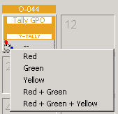
By selecting Red in this menu, a colour can be assigned to the tally within the GPO. This means that a red tally link is created. In this case the GPO will become active as soon as the assigned Source receives a red Tally.
If multiple colours are selected (for example Red + Green or Red + Green + Yellow), a red-green or red-green-yellow OR-link is created in the GPO with the selected signal.
Once you select a Assign Tally to GPO button on a virtual Panel it will blink orange/grey. Now it is possible to assign a source by selecting on the same page. Once assigned it will be displayed within the Assign Tally to GPO button.

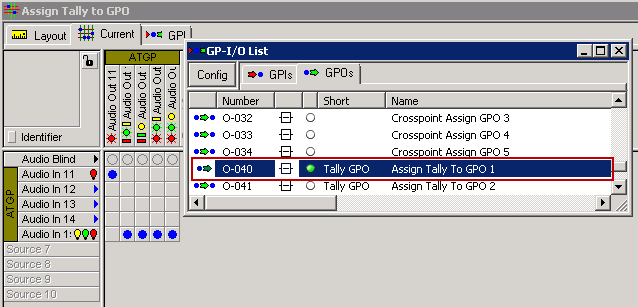
The GPO will receive the following entry:

If multiple colours are selected (for example Red + Green or Red + Green + Yellow), a red-green or red-green-yellow OR-link is created in the GPO with the selected signal.

Now as soon as a Target is switched to Assign Tally 1 and sends a red tally the GPO will become active.
Mimic Button
![]()
The Mimic Button function enables you to replicate button functionality of other functions in the same panel.
To replicate a button...
- First, select the Mimic button. Keep it pressed for several seconds.
- When the Mimic key blinks, select any another button.
The second button's function is now replicated to the mimic key. The "blinking" has stopped.
To unassign a mimic'ed function...
- Pressing the transformed Mimic Button for several seconds will cause it to blink again
- You can now choose another button or disable the Mimic function.
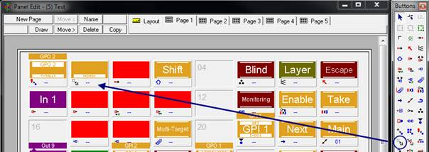
By default, this button is displayed with the caption Mimic in white lettering on a light-orange background, as long as no other function is copied.
Functions that can be assigned to Mimic Keys are:
- Display Source/Target
- Layer
- Rotate Source/Target (but they will take over the behaviour of rotate source and targets buttons as well)
- Reference Source/Target
- Multi Target
- Multi Target from Source
- Take
- Enable
- Source of Target
- Target of Source
- Lock
- Storage Group
- Blind
Functions that cannot be assigned to a Mimic Keys are:
- Generic
- Escape
- Shift
- Next
- Main
- Previous
- PTT
- Induce Level
Induce Label Text
![]()
Using the button Induce Label Text, the primary label on a virtual panel can be changed.

By default, this button is displayed with the caption <nosignal> in white lettering on a light-orange background as long as no signal is assigned to it. If the function was placed on a signal button, it will take on the signal path's name, for example Camera3. The label can subsequently be changed on the virtual panel by simply overwriting it.
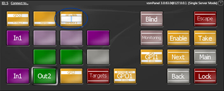
If an Induce Label Text button is placed on a panel, the following new tab appears in the properties window:
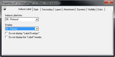
Using the options in the drop down menu located below Induce Label into, the changed label can be saved in the protocol label or the external label. The drop down menu under Display can be used to change the display on the button between primary, secondary, video mixer, protocol and external label.
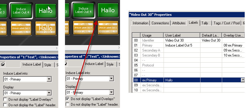
If the option Do not display "Label Overlays" is ticked, duplicate labels are not displayed. Within this example the Primary label is overlayed by the ex.Primary label. As soon as Do not display "Label Overlays" is checked the Primary label is displayed as it is defined under Display:
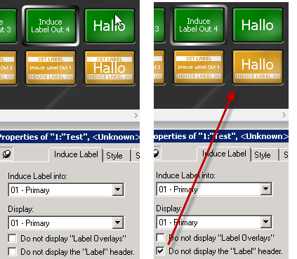
And if the option Do not display the 'Label' header the white banner with Set Label written on it will disappear.
Queue Control
Insert
![]()
With the Insert function, loop-through devices, such as frame synchronizers, can be added into the signal chain. If this button is selected, the corresponding device is switched onto the selected target.
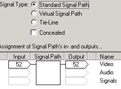
Loop-through devices can be created by assigning them an input and output port.
Drag the created loop-through device and drop it onto an Insert button. (It doesn't matter if you choose the Source or Target)
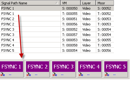
Pressing an Insert button will insert the loop-through device. It is possible to select more than one which will create automatically a chain of loop-through devices. Clicking again on an Insert button will remove the loop-through device again. The position doesn't matter, vsmStudio will calculate the right path.

Timer
![]()
The Timer function is used to display a timer on the control panel.
- To assign a timer, select the function and click on a button. It will display the timer now.
Placing the button on the panel directly from the panel toolbox enables the use of DAS.

Timer button
The default colouring for this button consists of three white question marks on a light-orange background as long as no timer is assigned. As soon as a timer is assigned to the button, its name will be shown. Placing a time on a panel will add the following tab in the button's properties window:
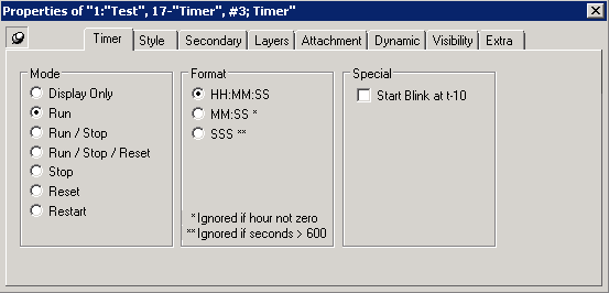
Below the option Mode, different button options can be defined:
- Display Only: The timer placed on the panel will only be displayed.
- Run: The timer can be started on the panel.
- Run/Stop: The Timer can be started and stopped.
- Run/Stop/Reset: The timer can be started, stopped, and reset.
- Stop: The timer can be stopped.
- Reset: The timer can be reset.
- Restart: The Timer can be restarted.
Format allows the choice of three different views:
- HH:MM:SS displays hours, minutes, and seconds in double-digits.

- MM:SS displays minutes and seconds in double-digits.

- SSS displays seconds in triple-digits.

If the option under Special is ticked, the timer will start to blink at 10 seconds.
Change Panel
![]()
The Change Panel button allows jumping from the current panel to another panel with a different panel ID.
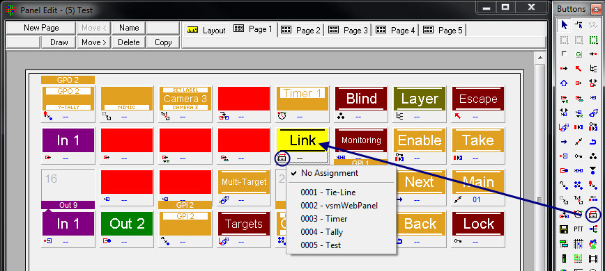
Change panel
The default colour for this button is a white caption on a grey background.
After a left-click onto the small symbol in the bottom left corner of the button, it is possible to select the panel ID to which the button should refer.

No Assignment is checked by default. This option also allows the reversing of previously made assignments. After placing a Change Panel or Link button on a panel, the following tab appears in the button's property window:
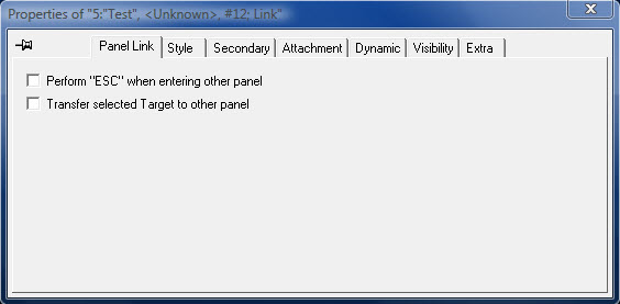
Panel link properties
With Perform "ESC" when entering other panel, the function of an Escape button can be replicated for page changes, so that all currently selected buttons are reset.
Transfer selected Target to other panel allows selecting an output on a panel and then using the Link button to jump to a different panel to choose the relevant input. Once the input is selected, the Link button must be used to jump back to the initial page.
Storage Groups
![]()
Use the Storage Group button to assign a storage group to a control panel button. With this button, you are then able to load/save a specific storage group.
- Assign the Storage Group function to a button first.
- Then, drop any existing storage group to this button to assign it.
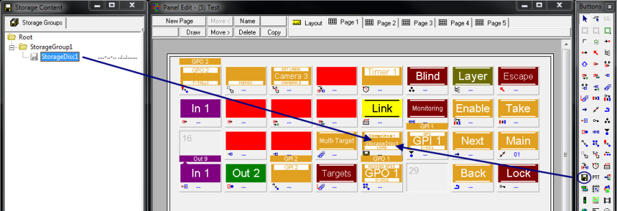
When no storage groups are assigned, the "empty" button is displayed with three white question marks on a light-orange background. As long as no storage Group is assigned the button cannot be observed on a virtual panel.

Once a storage group is assigned, its name is shown on the button. Per default Load is activated.

When a storage group has no content it is displayed greyed out on a virtual panel.

Placing a Storage Group button on a panel will add a Storage tab to the button's properties window:
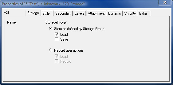
Under Store as defined by Storage Group it is possible to select which functions should be available for this storage group or storage disc on the panel: Storage Groups can either be loaded, saved or both with one Storage Group button.
- Load: Load will load the content stored in the Storage Group. As soon as the content has been loaded the button changes its colour to active. As soon as the status of the content doesn't match to the real status the button changes its colour back to normal.

- Save: Save will save the content to the Storage Group. As soon as the content has been saved the button changes its colour to active. As soon as the status of the content doesn't match to the real status the button changes its colour back to normal.

- Save + Load: Click once and the content of the storage group will be loaded. Click and hold and the new status of the content will be saved and can be loaded with the same storage group button again.

Through Record user actions, Storage Groups can be set to be loaded or recorded.
- Load/Play:

- Record: Will record actions and fill the storage group with storage objects but will not execute it. Click once the record mode is activated and the storage button starts to blink. Furthermore a record symbol appears in the upper right corner. Now you are able to record the desired content. Click again and the record mode will stop.

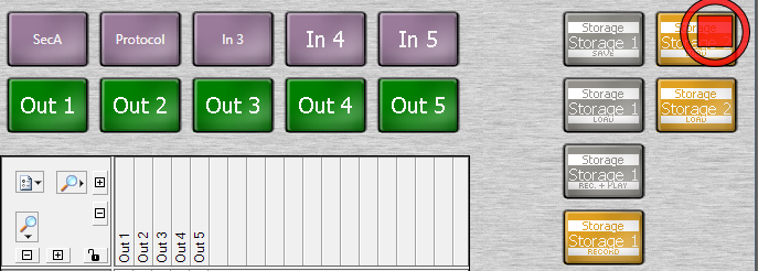
A recorded storage disc will be displayed with a red dot.

When activating the record mode without performing any action and selecting the storage button again the storage disc gets empty.

- Record + Play: Will record actions and save it to the storage group and will execute it when selecting the storage groups button again. For recording you need to click and hold the storage button.

Push to Talk
![]()
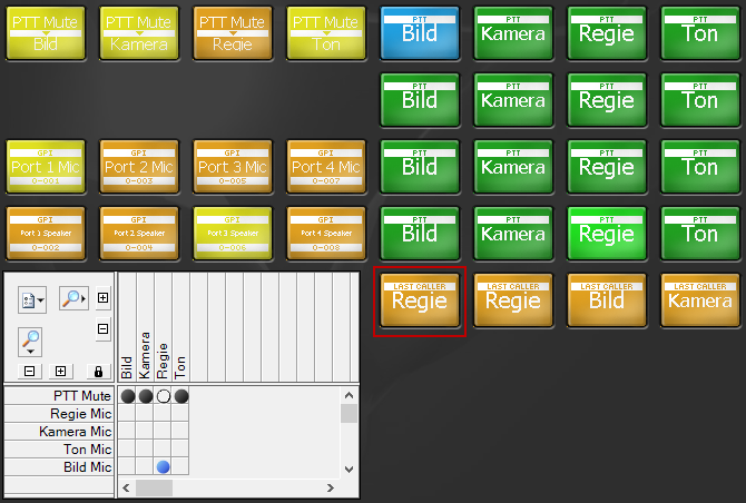
Use the Push to Talk function to create a virtual intercom.
Therefore you will find a Setting called "PTT Settings" within the Matrix Properties. There, you can pre-define the colors used by the PTT function.
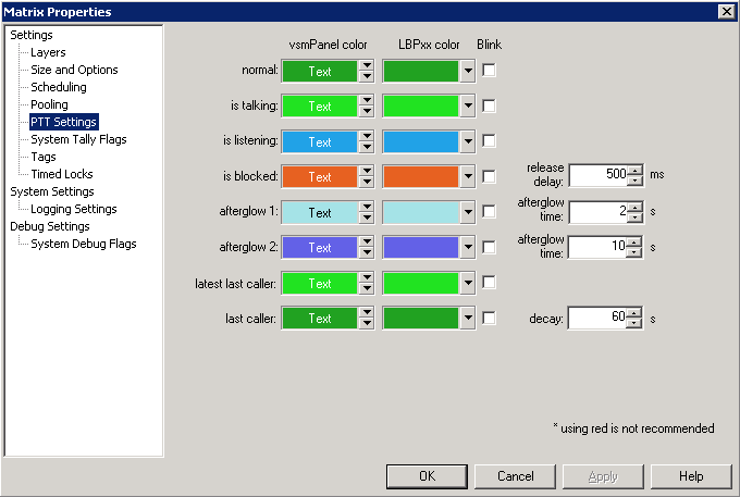
- Release delay:
- Afterglow time: Time setting for afterglow on a incoming call. The button will light up in the afterglow 1 color and after that will light up in afterglow 2 color.
- Decay: Time setting for blocked signal. Will define how long blocked signal will be displayed.
In order to use PTT you need to create a special Pseudo Rule. In this case you use the tab Ports within the Pseudo Devices.

- Target: Targets from Signalpath list or matrix
- Source: Sources from Signalpath list or Matrix
- Target GPO: GPO to activate the Loudspeaker
- Source GPO: GPO to open the Microphone
All used signal within the Port list will be colored up within the global Pseudo list. Please note that the Global Pseudo list can influence the PTT function.

To create a panel just drag & drop the crosspoints and source into the panel and assign the PTT out of the toolbox. The target will be displayed within the button (Talk to button).
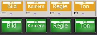
Drag & drop Mic source after assign PTT function. This will create a reply button (Reply button).
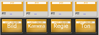
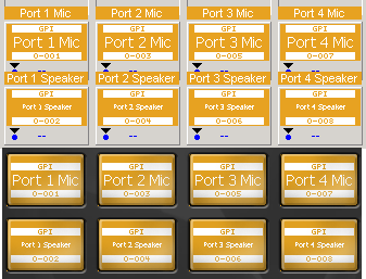
Loudspeaker GPO and Mic GPO just for visualization, not needed on the panel.
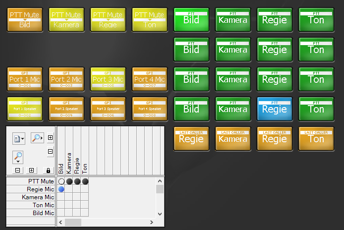
When you press a push to talk button it will be displayed in the is talking color. At the same time the target will be displayed in the is listening color.
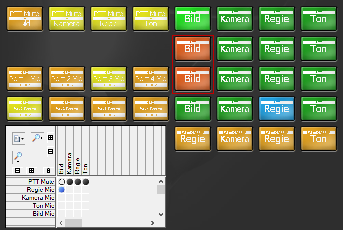
Once you release the push to talk button the source will first light up in the afterglow 1 and after a while in the afterglow 2 color until it turns again into the push to talk color.

When you try to push another source on a target that is already is in use it will be blocked. This is signaled in a block color.
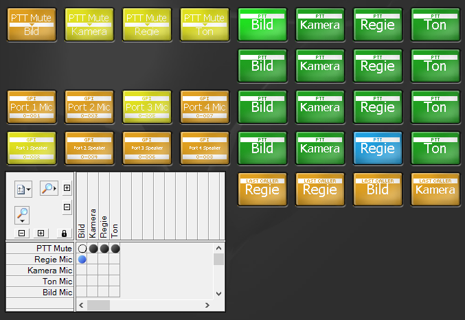
The last caller button allows you to reply in opposite direction once a crosspoint has been made.
Shuffle
![]()
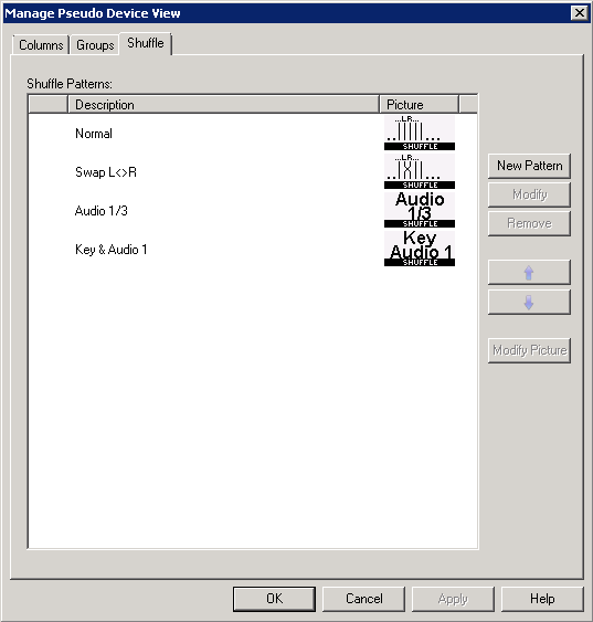
With the Shuffle button it is possible to manipulate the Pseudo Device rules. Under Pseudo Devices/Config/Shuffle you can create user defined Shuffle patterns. When selecting New Pattern the Channel Shuffle Pattern window opens.
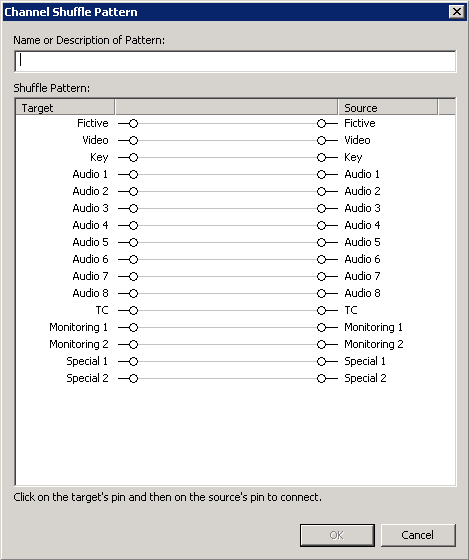
Here you can decide which channels should be twisted and new arranged. To do this click on the targets pin and then on the source pin to connect.
When you click once on a target it turn blue.

When you click again the connection breaks up and you are able to connect to another source.

When you click once again on the target pin or on another one you connect it to blind.

In the following scenario the behaviour is manipulated insofar that the channels Audio 5 and Audio 7 are switched.

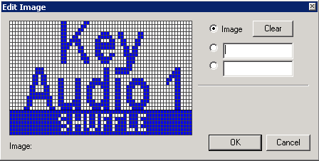
You can create user defined Bitmaps for each new created pattern either by pressing Modify Picture or by double-clicking on the picture. This bitmap will be used on a virtual panel.
When placing a shuffle button on a panel it is displayed with the caption Shuffle in white lettering on a light-orange background. In the properties you will find the additional tab Shuffle.
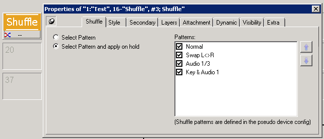
Every created Shuffle pattern is displayed on the right hand side under Patterns. There you can select which one to use.
- Select Pattern: When Select Pattern is checked the new rule is applied as soon as you select the shuffle button and perform a switch. When using more than one pattern on one button the shuffle button toggles between the patterns every time you click on it.
- Select Pattern and apply on hold: When Select Pattern is checked the new rule is applied as soon as you select the shuffle button and hold it. When using more than one pattern on one button the shuffle button toggles between the patterns every time you click on it.

The order in which the patterns toggle goes from the top to the bottom of the Patterns list. You can change the order by moving the patterns up or down using the arrows on the right hand side.
Don't forget to place source and target buttons on the same page!
Visual Link
![]()
The Visual Link function is not button related. It is displayed on virtual control panels.
To use the Visual Link function, a frame must be drawn on a panel first. The Visual Link will be displayed within the framed area.
If the available space on the panel does not have a sufficient size, the entire panel can be enlarged in the Layout tab.
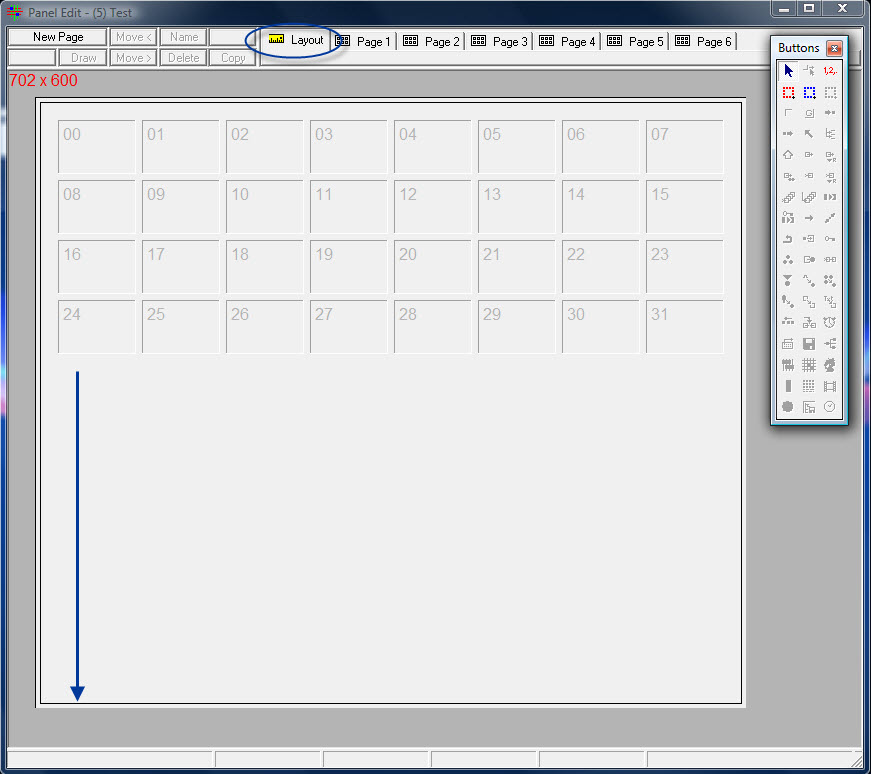
Increasing panel size
To create the Visual Link frame, select the function in the panel toolbox and draw the frame by moving the curser from top left to bottom right while pressing the left mouse button until the desired size is reached. The same procedure applies to the following functions, including Scheduler, Views, Map, Audio Level Meter, Alarm Management, Media Player, Browser, and Storage List.
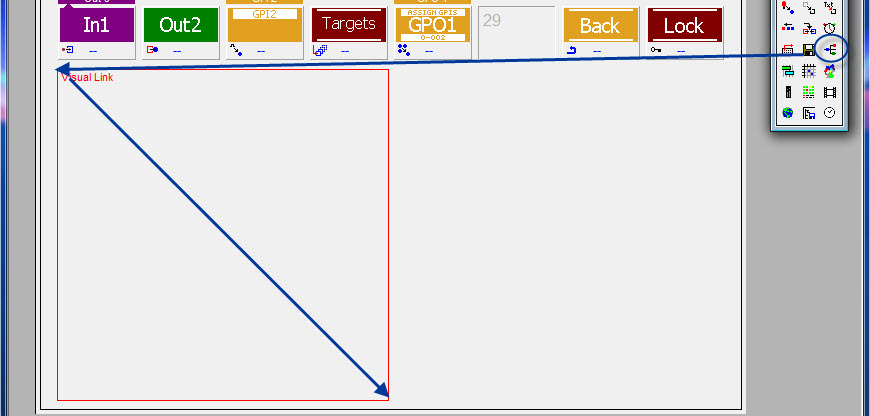
Visual Link frame
In the panel edit, the visual link has a red frame and has a red caption in the top left corner. On a virtual panel, signals linked within this frame are shown as a signal chain.
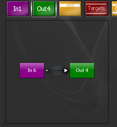
Visual Link on vsmPanel
To delete the Visual Link frame, right-click into it in the panel edit and select Delete.
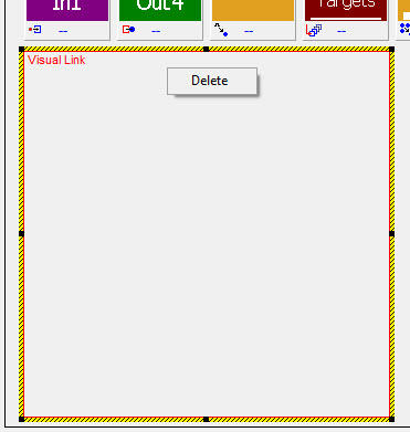
If a Visual Link frame is placed on a panel, the tabs VisualLink, Colors, and Visibility appear in the properties window.
The second tab allows changes to colour and opaqueness of the Visual Link. As with the buttons, the colour can be changed in the field next to Color. Similarly, opaqueness can be changed directly in the field beside Opaque or by using the slide control.
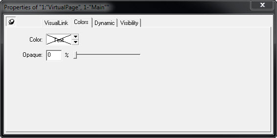
The following options are available under the VisualLink tab:
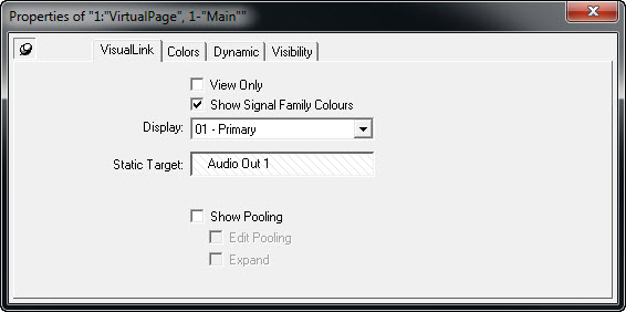
Visual Link properties
If View Only is ticked, the Visual Link will only be displayed. Show Signal Family Colours allows the display of colours assigned to signal path families in the signal path list.
The drop down menu next to Display offers the choice of which label should be displayed in the Visual Link. The options hereby include Identifier, Primary, and Secondary label (see Labels).
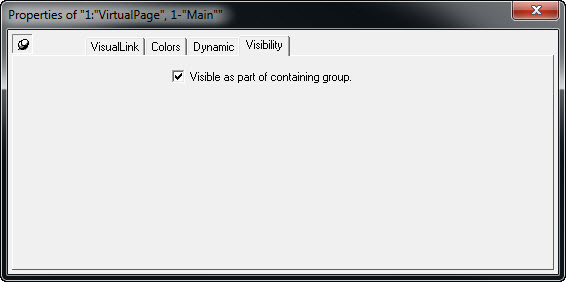
Visibility properties
Using the option under the Visibility tab, the Visual Link will remain visible within a group.
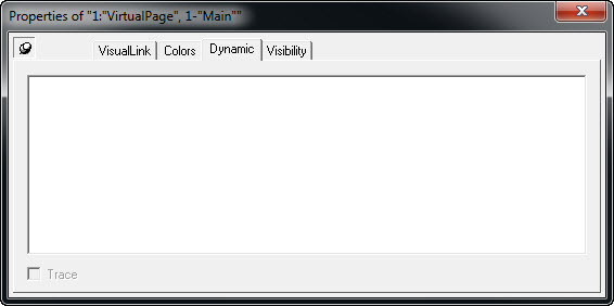
The tab Dynamic provides space to enter Dynamic Attachment Scripts.
Scheduler
![]()
Creating Channels
In order to be able to use the Scheduler, corresponding channels must be created first. This can be done in the Matrix Properties view under the Channels tab.
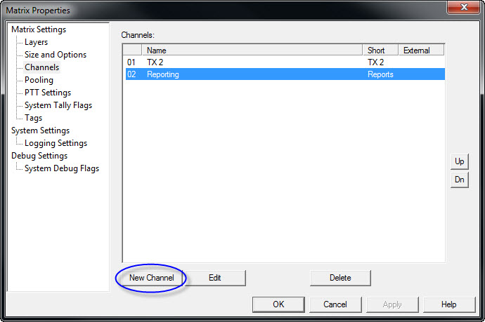
Upon selecting New Channel, a window opens in which a new channel can be set up.
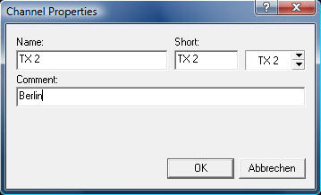
Enter a relevant name for the new channel and confirm the input by pressing OK. Close the Matrix Properties view after all necessary channels have been created.
Create Control Panel with Scheduler
Select the Scheduler function in the panel toolbox and draw a frame as describe above across the side of the panel edit on which the scheduler is to be added. In the panel edit, the scheduler has a black frame and a white caption on black background in the top left corner. The scheduler frame can be deleted by right-clicking into it.
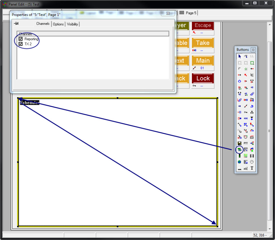
Create scheduler
When the window for the scheduler has been created, the properties view will open automatically. In this view, additional settings can be adjusted. The first tab allows the choice of which channels will be displayed in the scheduler.
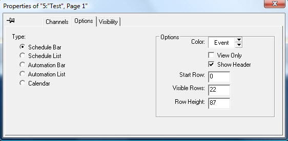
Scheduler options
The second tab currently provides four view options for the scheduler:
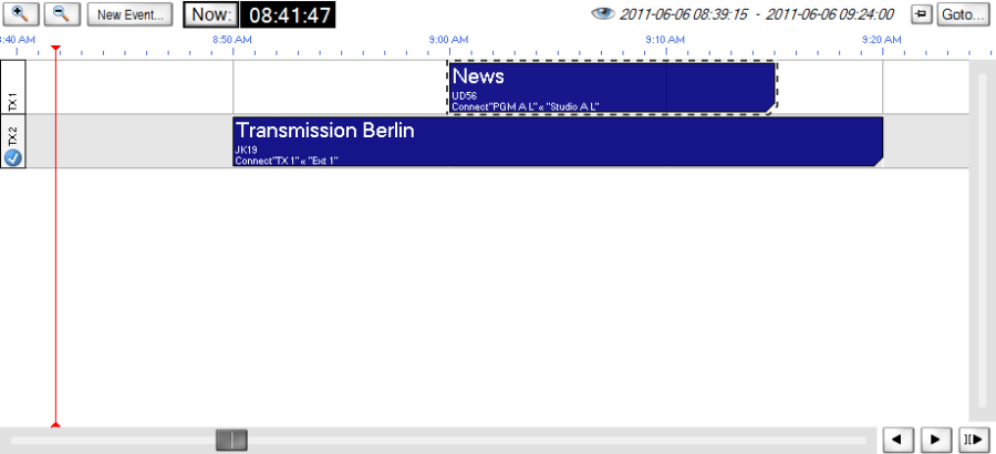
Schedule Bar
With the Schedule Bar, events can be created and displayed on a time line.
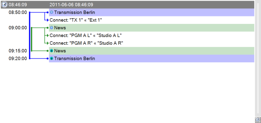
Schedule List
The Schedule List shows all current switches per channel. Events cannot be displayed in this view.
The Automatic Bar function is currently not supported.
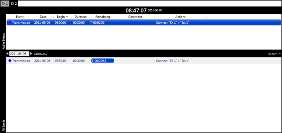
Automation List
Through Automation List, events can be created while they are displayed as an automation list. Each event is clearly distinguishable through automatically generated colours. Moreover, events are automatically organized into active events with a five minute preroll and planned events per channel. This list comes with an integrated search function to quickly find created events.
Calendar
With the Calendar function, events can be created and displayed in a calendar view. In addition, this view offers a collision test for each channel. As soon as a time conflict is detected within a channel, the interface will show the corresponding collision.
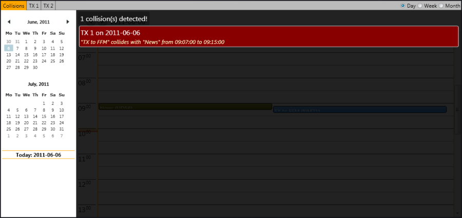
View Properties
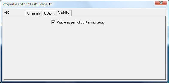
Visibility tab in the scheduler properties
The option Visible as part of containing group can be activated or deactivated in the Visibility tab. If active, the scheduler area will be changed in accordance to a page change. Consequently, if no scheduler was created on the relevant page, the control panel will not show one. With this function, multiple scheduler windows can be configurated for multiple pages, for example to allow the use of multiple views. If this option is not activated, the scheduler window will not change in the event of a page change. All other scheduler settings are taken from the vsmPanel.
New Event
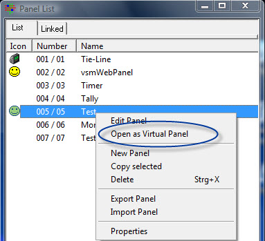
The procedure for the creation of events always remains the same, regardless of the view option chosen for the scheduler. To create a new event, select the control panel on which the scheduler is located and open it as virtual panel by right-clicking onto it in the control panel list.
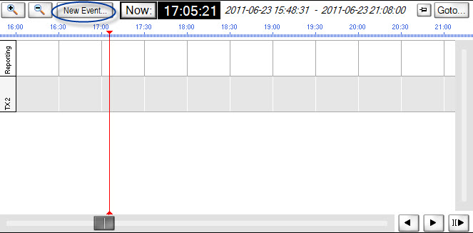
Next, select New Event in the scheduler view to create a new event.
This will prompt the following window:
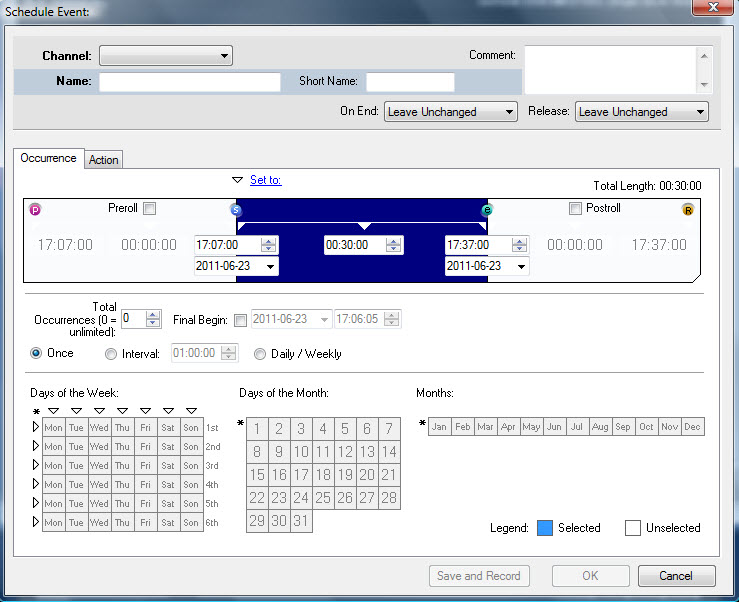
In a drop down menu on the top, the previously selected and activated channel can be chosen. Next, the event can be created for the selected channel.

In the next step, enter a name for the event. As soon as a channel has been chosen and a name entered, the previously greyed out confirmation button OK in the bottom right become available.

Starting time, duration, and end time for the event
The time for the start of an event can be set in hours, minutes, and seconds along with a date in the field Occurrence. The end time will automatically be added once the duration of the event has been entered.

Preroll and postroll
If Preroll and Postroll are ticked, durations for postroll time after and preroll time before the event can be entered there. These times can be defined either as start or end time points, where p stands for Preroll, R for postroll (Release), s for the start, and e for the end of the event.
One-Time Event
There are two possible ways to set up a one-time event: The starting time of the event can be chosen through the drop down menu under Set to. The scheduler will automatically add the duration (between one and 15 minutes) entered here to the current time, which then becomes the starting time for the event. 
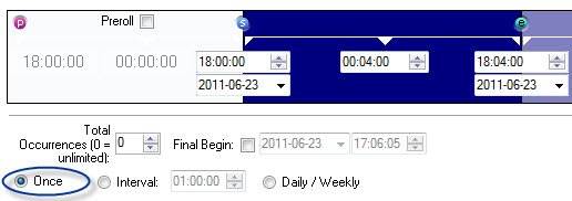
Alternatively, it is possible to enter a start and end time or the duration of the event as described above. Select the option Once after these entries have been made to indicate that this event is a one-time event.
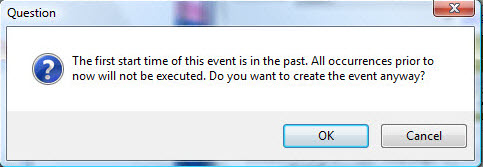
After confirming the entries by pressing OK, event actions can be defined. The scheduler will notify the user if the start time of the event was set before the current real time.
Repeated Event
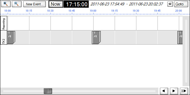
A repeating event can be set up in multiple ways. The duration, after which the event repeats itself, is entered under Interval.

It is, for example, possible to create an event that repeats itself hourly.
An event can also be set to repeat on certain weekdays, dates, and certain months. To do so, select the option Daily/Weekly.
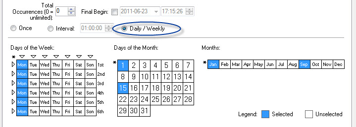
In the field below, certain weekdays (multiple selections are possible, for example all Mondays), dates, and months can be chosen for the repetition of the event. These fields can be individually selected and deselected by repeatedly clicking onto them. Blue colouring indicates that this day, month, or date is selected; white indicates that it is not selected.
Event Actions
Once time, duration, and repetition of the event have been set, the event action must be defined. To do so, select Save and Record.

In a new window, the following recording modes are available:
- s > e: from beginning to end of the event
- p > R: from postroll to preroll
- p: preroll
- s: beginning
- e: end
- R: release (postroll).
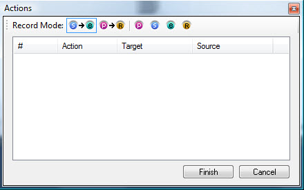
Recording and saving actions
To record and event action, the event phase (that is from preroll to postroll) for which an action is to be defined must be chosen first. Next, the targets and sources whose links will be part of the event must be selected, for instance Out4 and In5. The recording mode is indicated by a red record symbol on the panel.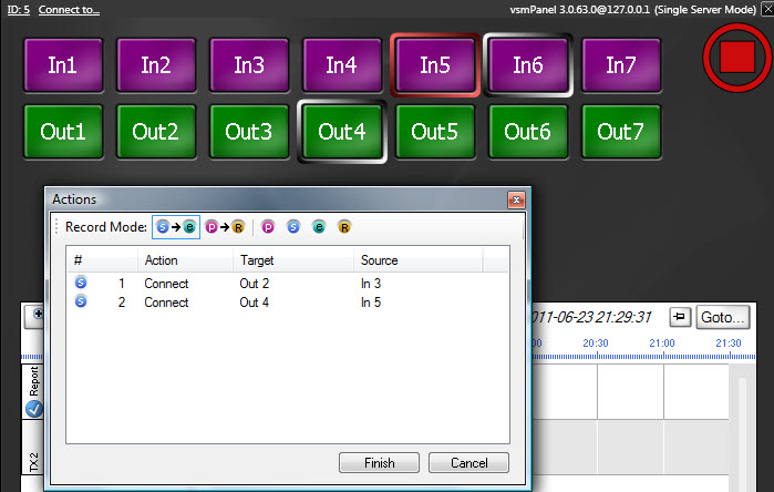
Press Finish to confirm the entries.
Clone Events
To duplicate an event, right-click onto the event that is to be copied and select the option Clone Event. 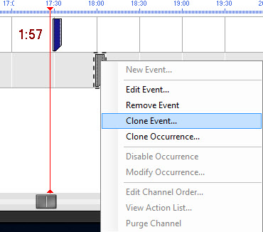
A new window opens, in which the event settings described above can be adjusted.
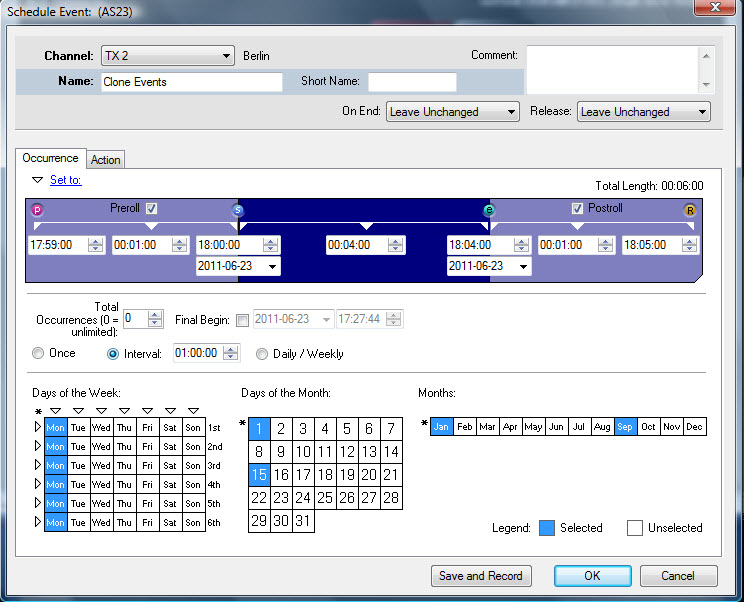
Similarly to the procedure described above, this window requires the input of a name, channel, etc. for the cloned events (see New Event).

Beside Total Occurrences, the number of repetitions can be defined. The field besides Final Begin allows the definition of the time of the event's last repetition.
Scheduler Navigation
The scheduler features a so-called Date Picker that allows an optimized search for an event by selecting an exact date, to which the scheduler view will jump.
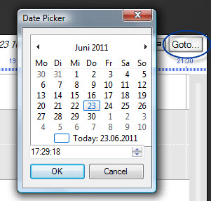
Navigation of the scheduler is made easy by the three arrows located in the bottom right corner of the window. Using them, it is possible to jump directly to the next or previous event or to the next gap.

Views
The Views function allows the display of views on a virtual panel. They can be used either as display option only or to switch crosspoints. The Views function requires a frame. To create it, select the function in the panel toolbox and drag the cursor from the top left to the bottom right while pressing the left mouse button to draw a frame in the required size.
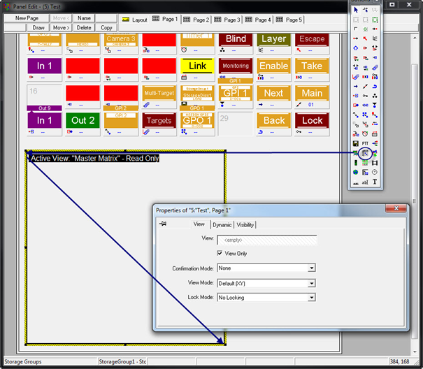
Views have a black frame with the white caption Active View and the name of the currently selected view on a black background in the panel edit. If no view has been assigned, the read-only view of the master matrix (see Master Matrix) is shown.
A view must be dragged and dropped from the views list into the views frame's properties window in order to be displayed on a virtual control panel. This window also allows the choice whether the view will be read-only or if it can be edited.
View Tab
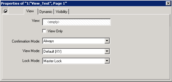
View: A view must be dragged and dropped from the views list into the views frame's properties window in order to be displayed on a virtual control panel. If no view has been assigned the master matrix is shown.
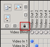
View Only: This window also allows the choice whether the view will be read-only or if it can be edited. When the attribute 'View Only' is unchecked a lock symbol appears in the Views page Item:
Confirmation Mode:
- None: When selected, the Confirmation Mode is disabled.
- Always: When selected, the confirmation prompt will be displayed always when switching a crosspoint.
- Only if connected: When selected the confirmation only prompts when a Destination is already connected to a Source. When a Destination is connected to blind and you switch to a source vsmPanel won't display a confirmation prompt.
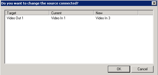
Confirmation Prompt
View Mode:
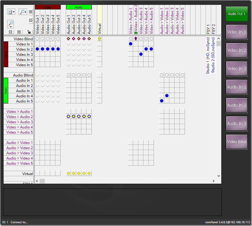
- Default (XY): When activated, the crosspoint Matrix is visible:
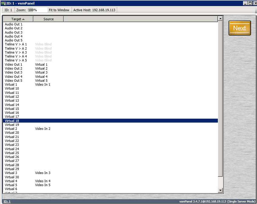
- List: When activated, Signals are displayed in a List view:
Lock Mode:
The Lock Mode allows the user to lock Targets within the Views Page Item in the Virtual Panel. When activated it is possible to Master Lock.
- No Locking: When selected, the Lock Mode is disabled. Lock is greyed out.
- Master Lock: When selected, the Lock Mode is activated. Lock is selectable.

Visibility Tab
The Visibility tab allows the option to set the view to remain visible as part of its containing group.
Find Source/Target
It is possible to search for Sources and Targets within the Views Page item. There are two ways. Either you select the button with the magnifying glass or by pressing Ctrl + f. When pressing Ctrl + f by default Targets will be searched until you click on the Source field. Using Strg + s will open the search box for Sources.
Using Strg + t will open the search box for Targets.
F3 will toggle between all results that are similar to the query.
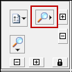
Collapse/Expand all Source/Target Families
Using the +/- symbols it is possible to collapse or expand Sources/Targets that are summed up under Signal Path Families.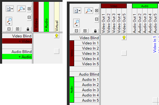
Alternatively you can double-click on the coloured background of the signal path family.
Jump To...
Within the View Page item on a virtual panel you can use the function Jump to…. to jump directly to the position of a certain signal path family.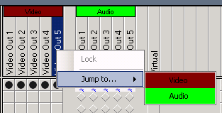
Options
Furthermore you can decide which type of signal label should be displayed.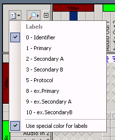
Use special color for labels will display the labels in a light blue colour. This is only the case for labels 1-10. The Identifier is displayed in black.
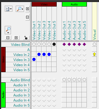
Change Border
You can change the border size of Sources and Target fields.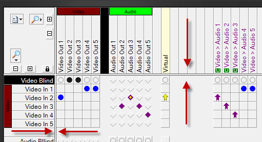
Map
![]()
The Map function allows the creation of button ranges on previously edited images. These can then be switched on a panel. In order to be able to create and edit image maps prior to their use, the Software Image Map is required. This function also requires a frame. To create a frame, select the function in the panel toolbox and drag the cursor from the top left to the bottom right while pressing the left mouse button to draw a frame in the required size.
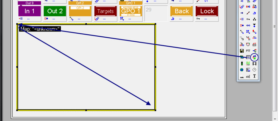
Image Map frame
In the panel edit, image maps have a black frame with the white caption Map and the name of the currently selected image map on a black background. Using the browser function next to Name of map file, the image map can be added to the frame. If no image map is assigned, the caption will read Map: ">unknown>". The Visibility tab offers the option to keep the image map visible in its containing group. The frame can be deleted by right-clicking into it.
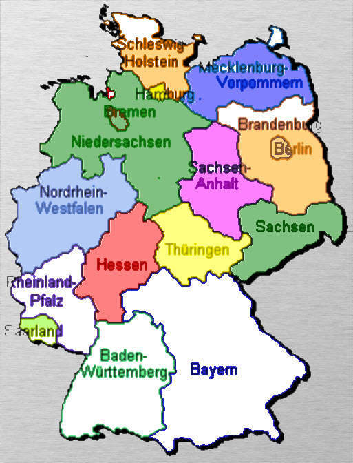
The button IDs corresponds to the ImageMap IDs.

Image Map on vsmPanel
Audio Level Meter
![]()
Using the Audio Level Meter function, peak meter data that is available as gadget can be displayed on a virtual panel. Again, this function requires a frame.
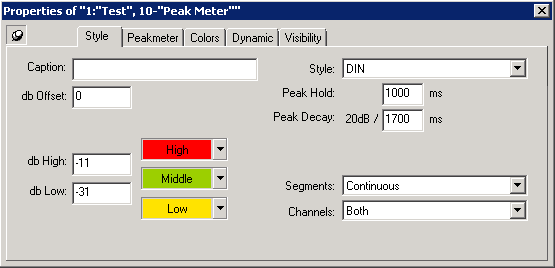
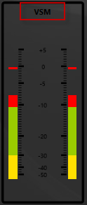
- Caption Within caption you can enter a name that will be displayed above the peak meter.
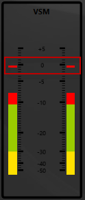
- Db Offset: Will add a possitv or negativ offest to the Peakmeter (in db).
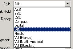
- Style: Within style you can choose between different Peak Meter standards. 'DIN' is selected by default.
- Peak Hold: The Peak Hold defines the length of time in ms the peak remains indicated.
- Peak Decay: Peak Decay defines how long it takes for the peakmeter to drop by 20dB (in ms)
- db High: Peakmeters are devided in three color sections. Db High defines at which db value the high color begins.
- db Low: Peakmeters are devided in three color sections. Db High defines at which db value the low color begins.
- High/Middle/Low: Here you can define the colors of the peakmeter sections.
- Segments: Using segments it is possible to divide the Peakmeter into single segments . It is possible to choose 26 or 53. Alternatively the peakmeter can be displayed continuously.
- Channels: Using Channels you can decide whether to display only one peakmeter (left or right channelr) or both.

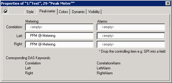
- Metering: Within the Metering DropZone the GadgetParameter containing information about the peakmeter can be dropped.
- Alarms: Here specified alarms can be dropped which will execute as soon as the correlation, left or right channels values cross a threshold. (Lawo Nova 73 --> AGC In 1 XDR:010:00:000 --> Condition Monitor --> Correlation Alarm/Alarm)

It is possible to create fake PPMs within vsmPanel. For this you need to add-fakeppmat the end of the Target entry field within the vsmPanel Properties.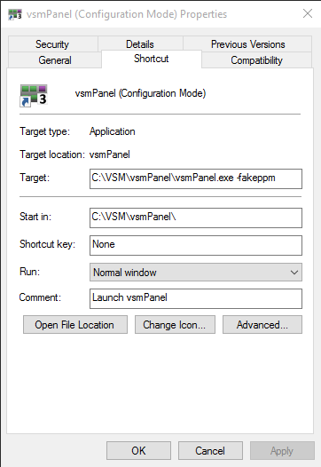
Alarm Management
![]()
Configuration of the Alarm Management Console
Prior to configuring an alarm management console on a virtual control panel, a free layout area needs to be defined in the panel area.
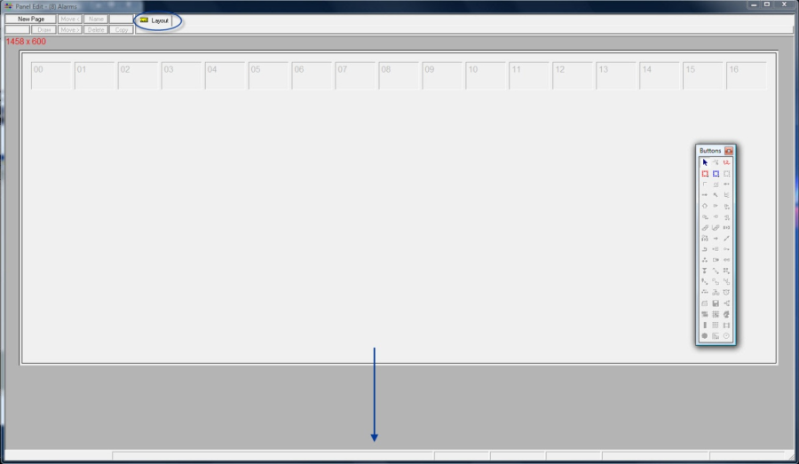
Drawing a layout area
Within this area, the page item for the alarm management can have any size.
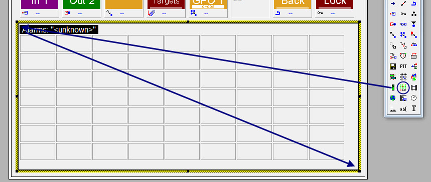
Placing an alarm management page item on the panel
Next, Alarms or AlarmStacks are dragged and dropped into any position in the alarm management console. In the panel edit, this function is displayed with a black frame and, as long as no alarms or alarm stacks are assigned to it, the white caption Alarms: "<unknown>" on a black background. The frame can be deleted by right-clicking into it and selecting Delete.

Assigning alarms and AlarmStacks
When an alarm becomes active, it will be displayed in the appropriate colour. At the same time, the individual, active alarm is indicated in an AlarmStack. If this panel ID is opened with the vsmPanel, the following alarm management console will appear.
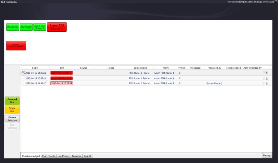
Alarm management console
Operating the Alarm Management Console

Individual alarms
Active alarm notifications are highlighted and displayed in the appropriate colour in accordance with the colour specifications (see Alarm Module). The process status of the alarm can be accessed by left-clicking onto an active alarm. A right-click on the active alarm, however, will open a sub-menu offering the following options: Process, Acknowledge, and View in X/Y Panel.

AlarmStack
The AlarmStack groups all individual alarms and shows the active alarm in accordance to the created priority list. The colours used hereby depend on the colours defined for each individual alarm (see Alarm Module). By left-clicking onto an active alarm, the process status of the alarm is activated. A right-click on the active alarm will open a sub-menu offering the following options: Process, Acknowledge, and View in X/Y Panel:
- Process: This option registers the user editing the alarm and puts the alarm into the process state. Depending on the control panel configuration, certain process panels can be created and equipped with the relevant switch information. The alarms are then saved in the history where they can be viewed at any time.
- Acknowledge: This option registers the user who confirmed the alarm and moves the alarm into a different sub category. The alarms are then saved in the history where they can be viewed at any time.
View in X/Y Panel: This option transfers the information belonging to the alarm to a control panel previously configured to this end.
Please note: all control panel interaction for processing or viewing requires an appropriately configured dynamic attachment script.
- Grouped Bus view: A click onto Grouped Bus summarizes all alarms in groups. They are, however, only summarized if they are independent from each other. Dependence can occur, for example, if the alarm for FSY 1 (picture lost) triggers an alarm on the TX path which is switched onto the FSY (and an appropriate alarm exists for it). In this scenario, all affected signals are shown at once. If the grouped bus is confirmed by pressing Acknowledge or edited further through Process, all alarms dependent on it are put into this state at the same time.
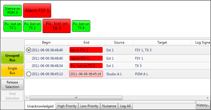
- Single Bus view
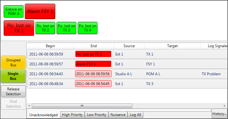
By clicking Single Bus, all alarms are listed individually. They are, therefore, not grouped, and alarms have to be changed to either the Acknowledge or the Process state individually. - Release Selection/Find Selection
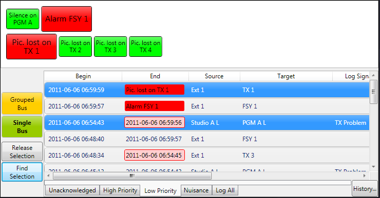
Using the button Release Selection, selected alarms (with a blue background) can be deselected. The function Find Selection allows the recovery of selected (with a blue background) alarms. For extensive alarm lists, this button helps to specifically focus in on the selected individual alarms.
Columns of the Alarm Management Console

Alarm View details
- Begins shows the time and day on which the alarm became active.
- End: For active alarms, the name of the alarm will be displayed. For inactive alarms, the end of the alarm will be displayed.
- Source: If possible, this column shows the connected source that is affected by the alarm.
- Target displays the target corresponding to the alarm.
- Log Signaled displays the name used for the reporting. This entry can be found in the vsmStudio.log file (see Folder LogFiles). The name is defined during the set-up of the GPIO (see Alarm GPO).
- Alarm displays the name of the alarm.
- Priority indicates the priority of the alarm
- Processed shows at what time and date the alarm was changed to the Processed state.
- Processed by shows the vsmPanel PC user who put the alarm into the Processed state
- Acknowledged indicates the time and date at which the alarm was changed to the status Acknowledged.
- Acknowledged by indicates the vsmPanel PC user who changed the alarm's state to Acknowledged.
Alarm Report
A report for the problem can be saved by selecting the text icon in the backmost part of the alarm list.
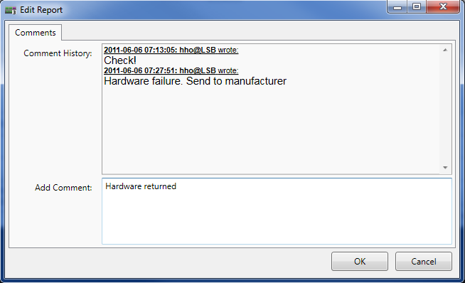
Report window
- Unacknowledged shows all alarms that have not yet been acknowledged.
- High Priority shows all alarms (acknowledged or not) with high priority.
- Low Priority show all alarms (acknowledged or not) with low priority.
- Nuisance shows all alarms that have been assigned the status Nuisance.
- Log all shows all alarms.
- History shows past alarms and allows the export of "all" alarms or alarms from the "current day" into a file.
Media Player
Browser
![]()
The Browser function allows the display of websites or switch configurations online on a virtual panel. It also provides complete internet browser navigation. This function also requires a frame.
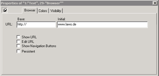
The homepages that will be displayed in the browser window when the panel is opened with vsmPanel can be entered under Initial in the Browser tab of the function's properties window. The standard URL can be entered in the field beside URL.
- Show URL: If the box in front of Show URL is ticked, the web address will be shown.

- Edit URL: If Edit URL is checked, the address can be changed. Once selected the initial URL will not be greyed out anymore.

- Show Navigation Buttons: The option Show Navigation Button allows the user to navigate to the previous or the next site just as with a normal browser.

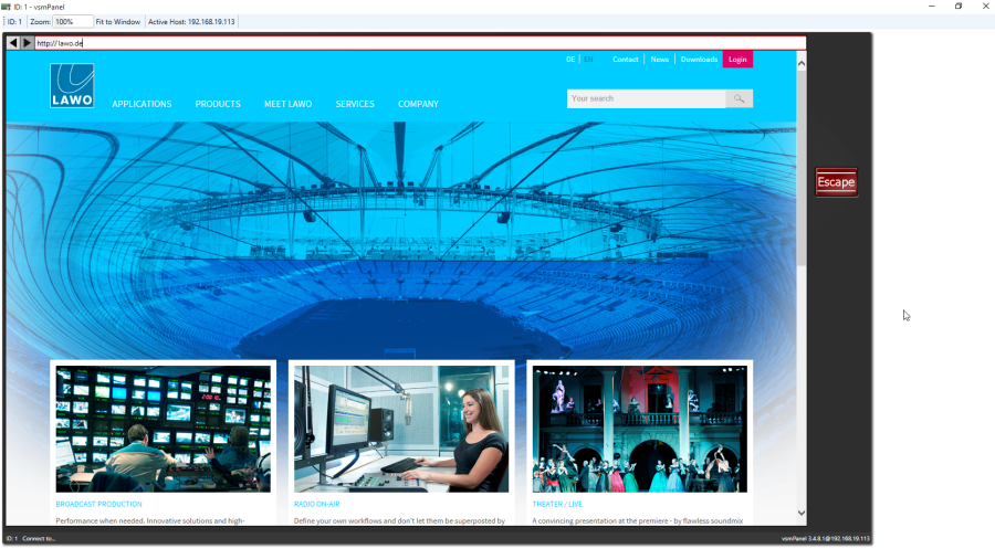
- Deleting a frame: The frame can be deleted by right-clicking into it.
Editing the System Registry incorrectly can cause serious issues that may require you to reinstall the operating system. We cannot guarantee that problems resulting from the incorrect use of the Registry Editor can be solved. Use the Registry Editor at your own risk.
By default the Browser page Item emulates IE. You can also emulate Chrome. The integrated chromium browser engine is wrapped in the "Browser.zip" file which is part of the release package. Unzip Browser.zip and place the browser folder in the vsmPanel installation folder. You can deactivate the engine by deleting or renaming the Browser folder.

Storage List
![]()
The function Storage List allows the creation, loading, and saving of storage groups (see Storage Groups) on a control panel. This function also requires a frame. To create a frame, select the function in the panel toolbox and drag the cursor from the top left to the bottom right while pressing the left mouse button to draw a frame in the required size.
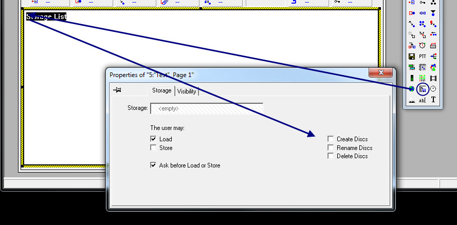
Storage List frame
- The Storage tab of the properties window offers the following options:
- The storage group or the storage disc that is to be used on the panel can be added in the field beside Storage using drag and drop.
- Under The user may, the functions to load and save storage groups or storage discs are offered.
- If the option Ask before Load or Store remains active, a click onto save or load will prompt a window asking for confirmation of the action.
- Create Folders enables the creation of new storage groups in the storage frame on the panel.
- Using Rename Folders, it is possible to rename new storage groups in the storage frame on the panel.
- Storage groups can be deleted using Delete Folders.
- Create Discs enables the creation of new storage discs in the storage frame on the panel.
- Rename Discs enables the renaming of new storage discs in the storage frame on the panel.
- Storage discs can be deleted in the storage frame on the panel using Delete Discs.
The frame can be deleted by right-clicking into it.
Clock and Date
![]()
The function Clock and Date allows the presentation of the current time and date on a control panel. This function also requires a frame.
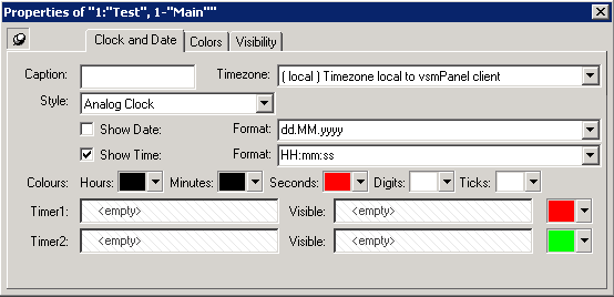
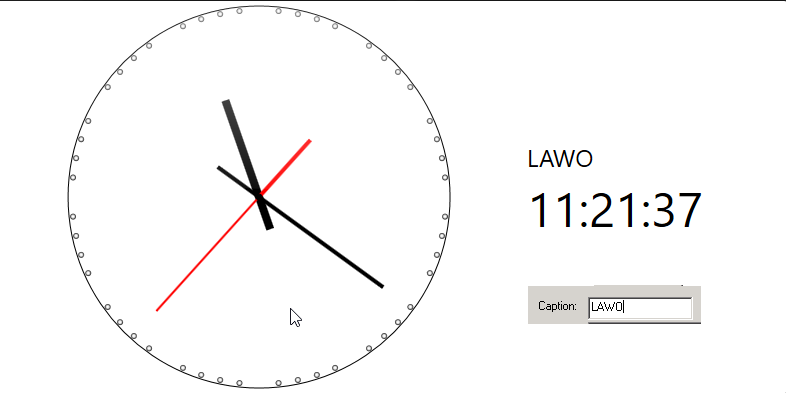
- Caption: In the entry field Caption you can type a title for your panel:
- Timezone: Under Timezone you can choose the right timezone for your region.
- Style: You can choose between six styles of clock presentation (Analog Clock, Analog Clock with Digital, Analog Timer, Digital Clock, Digital Clock with Date, Digital Timer) in the drop down menu Style.

- Show Date/Time: Decide whether you want to display only the date or only the time or even both in different format, respectively, by activating them with a check mark.
- Colors: Choose your desired colour for the depiction of the Hours, Minutes, Seconds, Digits and Ticks.
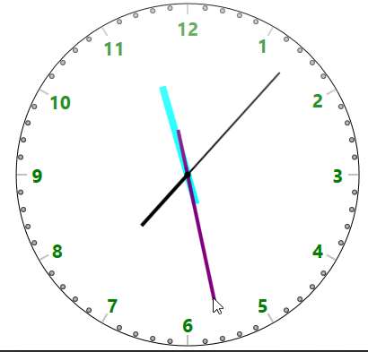
- Timer1/2: Include the presentation of timers by drag and drop the appropriate Gadget into the fields Timer 1&2.
- The frame can be deleted by right-clicking into it.
Picture
![]()
The function Picture allows the presentation of images on a control panel. This function also requires a frame.
Under the tab Picture you can import .png and .bmp images and choose your desired configuration of the Image. It is recommended to use .png images, because this format is capable of creating transparent areas within the image.
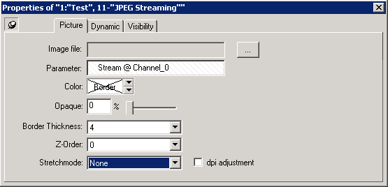
- Image file: Here you decide which Image to display.
- Parameter: Here you can drop a Stream GadgetParameter which will display a video stream on the virtual Panel.
- Color: Here you can choose a color for the picture Background. The effect is viewable when the Picture is smaller than the Frame (Stretchmode: Uniform). You can also choose a border color.
- Opaque: Here you can choose the Opaque of the background color.
- Border Thickness: Here you can activate if the picture should have a border and how thick it should be. (0 = no Border, 1-5)
- Z-Order: Here you can decide the plane order of overlapping pictures. -1 will place the picture behind the overlaying picture. 1 will overlay the picture on another.
- Stretchmode:
None: The image is placed (vertically and horizontally) centred within the image frame placed on the panel. It is displayed in its original size, so if the loaded image is bigger than the frame on the panel, parts of it might not be visible.
Fill: The loaded image is stretched to match the frame on the panel horizontally and vertically.
Uniform: The Imaged is stretched to fill the frame completely either vertically or horizontally by matching the image with the longer sides of the frame and without changing the ratio of the original image.
- Note: Unfilled gaps can occur.


- Uniform to fill:Does the exact same thing as ‘Uniform’ but matches the image with the shorter sides of the frame. Note: Parts of the image might be cut off.

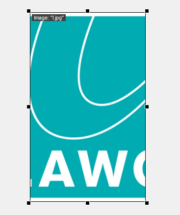
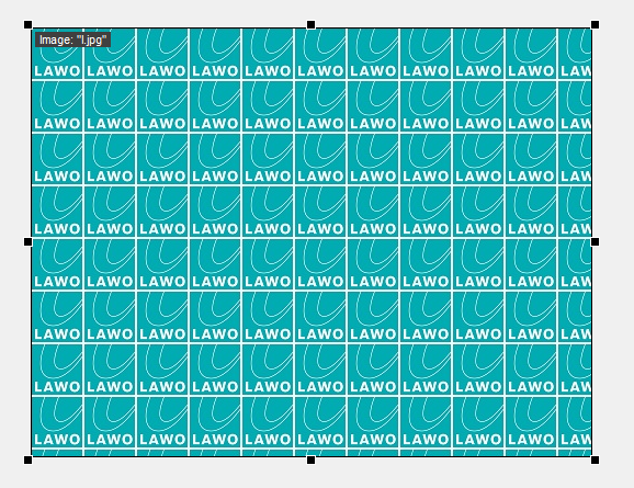
Tile: The image is placed in the button left corner of the frame in the original aspect ratio. It the frame is smaller than the image, it is repeated in right and bottom direction.
Note: For the making of the following visualization, a smaller version of the Lawo logo has been used to visualize the tile effect.
- dpi adjustment:

For testing your setup, you can find various graphics in different resolutions attached in this file: dpi_adjustment.zip
Parameter Entry Field
![]()
The Parameter Entry field allows you to change GadgetParameters by entering a new value or text within the entry field.
Within the section Parameter you can drop a GadgetParameter which will be assigned to this entry field.

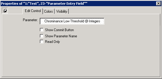
- Show Commit Button: Displays a reset and a confirm button on the right side of the entry field. The reset button will reset the Parameter to its actual value if you typed in another value but did not confirm it.
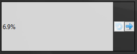
- Show Parameter Name: Will display the Name of the Parameter name.
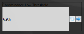
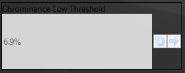
- Read Only: The value will be only displayed and can't be changed. The value and the buttons will be greyed out.
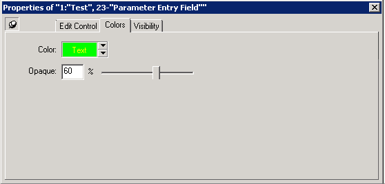
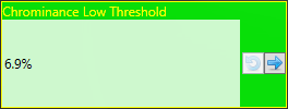
Under the colors tab you can change the color and Opaque of the Parameter Entry field.
Text
![]()
The function Text allows the presentation of text on a control panel. This function also requires a frame. To create a frame, select the function in the panel toolbox and drag the cursor from the top left to the bottom right while pressing the left mouse button to draw a frame in the required size.
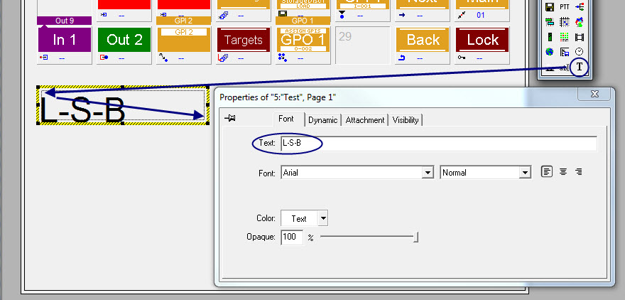
Text Frame
Type your desired text into the parameter entry field Text under the tab Font. You can configurate the font, colour and the opaque of your text within the properties. Your text can look like in the picture below.
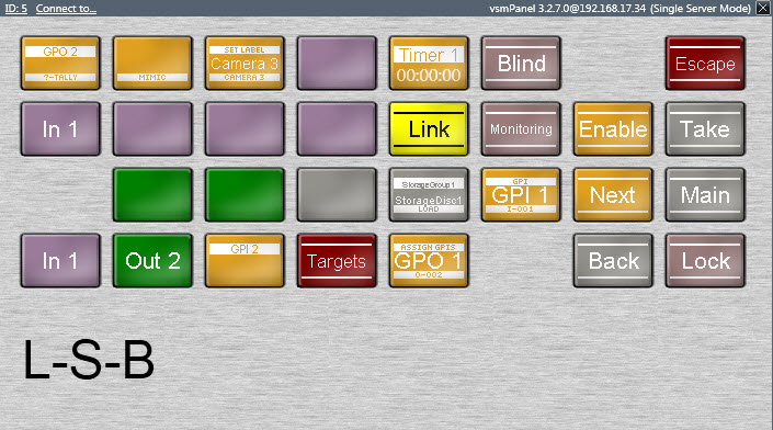
Text vsmPanel
The frame can be deleted by right-clicking into it.
- Panel Toolbox
- Select Object
- Copying and Moving Buttons
- Adding and Removing Buttons
- Define Virtual Pages
- Defining Sub Panels
- Grouping Elements
- Blank
- Generic Button
- Display Source
- Display Target
- Escape
- Layer
- Next, Main and Back
- Shift
- Source
- Target
- Rotate Source and Target
- Reference Source
- Reference Target
- Preview
- Multi Target
- Multi Target from Source
- Take
- Enable
- Source of Target
- Target of Source
- Lock Target
- Blind Source
- Connect Targets
- Control Button
- Assign GPI-I/O to Switchable Node
- Assign Multiple GPIs/GPOs to GPO
- Assign Tally to GPO
- Mimic Button
- Induce Label Text
- Queue Control
- Insert
- Timer
- Change Panel
- Storage Groups
- Push to Talk
- Shuffle
- Visual Link
- Scheduler
- Views
- Map
- Audio Level Meter
- Alarm Management
- Media Player
- Browser
- Storage List
- Clock and Date
- Picture
- Parameter Entry Field
- Text


