vsmStudio - Panel Editor 7 - Button Properties
Button Properties
The selection of a button will automatically open the button's properties window.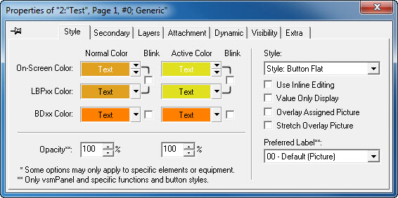
The title bar shows the following information:
- The panel ID, in this case 2
- The panel name, here Test
- Page 1 means that the button is located on the first page of the control panel.
- The button ID, in this case 0, and
- The button type, here a Generic button.
With the pin symbol in the top left, the window can be locked into one position on the monitor.
Style
The Style tab allows the choice of colour, opacity, as well as style of the button and the label that should be used. The setting under Normal Color represents the colour that is shown when the button is not active. To select colours, use the two arrows on the right side (top for the background, bottom for the font) of the field.
Colour selection for button background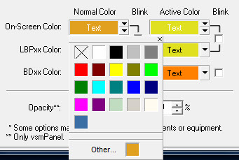
The field shows the currently selected button background colour and the text colour both on a monitor (On-Screen Color) and on a hardware control panel (LBPxx Color is initially changed with the on-screen color, but can be edited later). The colour settings for BDxx Color refer to an older control panel generation and do not apply to current devices.
In normal mode, colour saturation can be changed in the fields following Opacity. Ticking the box in front of Blink will cause the button to blink.
Under Active Colour, the same colour settings are available for the active state.
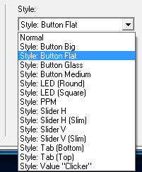
The drop down menu located below the Style header allows the choice of display styles for buttons. These different display possibilities are not shown in the panel edit and are only visible through the vsmPanel software.
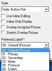
In order to make the value on buttons changeable, the option Use Inline Editing can be selected if a gadget parameter was placed on a button and the normal style was selected. If, on the other hand, Value Only Display is selected, the gadget parameter placed on the panel is only displayed.
The drop down menu under Preferred Label allows the choice of the displayed label for inputs and outputs.
Secondary

A Secondary Command is a button function. It allows buttons to be assigned functions in addition to their primary functions. Secondary commands can be accessed as tab in the panel edit's properties window. Alternatively, the relevant secondary function can simply be placed on the respective button while pressing the Ctrl-button.
The tab Secondary is empty by default. Different functions, for example GPIOs, signals, crosspoints, gadgets, panels, timers, or storage discs can be placed here and attached to different methods of execution.
These functions will then be executed as secondary function of the button in accordance to the options defined in this window.
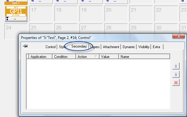
Once a secondary command has been added, a white S will be shown on green background in the bottom of the button.
If an element has been placed in the secondary field, the predefined columns Application, Condition, Action, Value, and Name offer different ways to specify further how the secondary commands are to be executed. The options available in the field under Action hereby depend on the selected function. 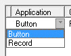
The options under Application and Condition are the same for all secondary commands.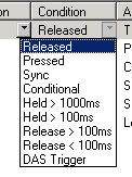
The following options are available under Condition:
- Released: The secondary function will be executed as soon as the button is released.
- Pressed: The secondary function will be executed when the button is pressed.
- Sync: If the button itself as well as the secondary command is a gadget parameter (see Gadgets) with the same function and the same value range (that is gain from 0 to -128dB), the value used in the secondary command will follow the value of the button.
- Conditional:
- Held > 1000ms: The secondary function is executed when the button is held longer than 1000ms.
- Held > 100ms: The secondary function is executed when the button is held longer than 100ms.
- Release > 100ms: The secondary function is executed when the button is released after more than 100ms.
- Release < 100ms: The secondary function is executed when the button is released before 100ms passed.
- Action for Sources:
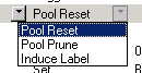
- Pool Reset:
- Pool Prune:
- Induce Label:
- Action for Targets:

- Disconect: Disconnect (default setting) connects the target with the blind source.
- Disconnect & Flush Queue:
- Previous: Previous connects the target with the previously connected source.
- Set Label Override:
- Master Lock:
- Master Unlock:
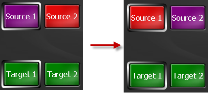
- Swap Source with Selected Target's Source: Will swap the selectedTarget source with the secondaryTarget source. Can be uses with a Generic button.
- Push Source to Selected Target: Will switch the selected Target Source to the secondary Target
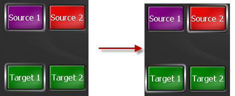
- Pull Source from Selected Target: Will push the secondaryTargetSource to selectedTarget Source.
- Induce Label:
- Action for Crosspoints:

- Connect: The crosspoint is placed.
- Queue: Connect &Flush:
- Queue: Auto-Acknowledge:
- Queue: Request Next:
- Queue: Disconnect & Flush: refers to the queue connect function.
- Toggle: Toggle switches between the crosspoint or the crosspoint blind > target at the push of a button.
- Action for Gadgets (Values):
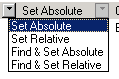
- Set Absolute: Set Absolute (default setting) changes a parameter to the value that was entered in the Value field.
- Set Relative: Set Relative will change the parameter by the interval defined in the Value field (with +/- as prefix).
- Find & Set Absolute:
- Find & Set Relative:
- Action for Gadgets (EntryField):
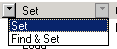
- Set:
- Find & Set:
- Action for Gadgets (DropDownList):
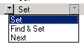
- Set:
- Find & Set:
- Next:
- Action for Panels:
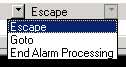
- Escape: Escape (default setting) deselects the active components of the selected control panel.
- Goto: Goto jumps to a different panel.
- End Alarm Processing: End Alarm Processing ends the alarm processing on the selected panel.
- Action for Timers:

- Run:
- Pause:
- Stop:
- Reset:
- Restart:
- Action for Storage Discs:
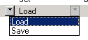
- Load: Load (default setting) loads a pre-defined storage group, Save saves it.
- Save: Load (default setting) loads a pre-defined storage group, Save saves it.
Value: Defines the Value to be set.
Name: Displays the name of the Secondary function.
With the function Assign DAS Alias that can be found below the panel name, the secondary function can be used in connection with Dynamic Attachment Scripts (DAS) by entering a unique name. This allows all secondary functions to be used dynamically. 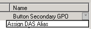
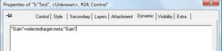
Dynamic Attachment Scripts can be used in combination with secondary commands. By combining the two, dynamic secondary commands can be generated on buttons. To do so, a signal or parameter has to be added in the secondary tab und button properties. Select the function Assign DAS Alias in the column Name and enter a unique name. This name must be used in the Dynamic window in the future.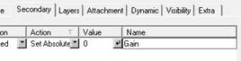
If, for example, the gain of the selected target is to be locked at -20dB on a generic button, place an arbitrary gain in the secondary window and define it according to the requirements (Set Absolute with value -20). Then, select Assign DAS Alias in the column Name, and enter a name, for example Gain. Next, the following script must be used in the Dynamic window: "Gain"=selectedtarget.meta:"Gain".
Layers
Under the Layers tab, certain layers can be activated or deactivated (see Pseudo Devices). 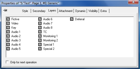
Attachment
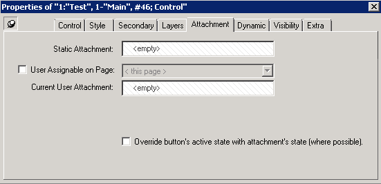
Static Attachment: Shows the static attachment.
User Assignable on Page: Allows you to assign the button from another page. Once checked you can choose from the available Pages in the Drop Down List.
On vsmPanel you need to press and hold the button until the page will switch. Here you can choose the button which should be assigned to this button.
<<User Assignable on Page.avi>>
Current User Attachment: Shows the currently assigned attachment from another page.
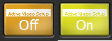
Override button's active state with attachment's state (where possible): Can be used with Gadgets that for example have an on/off status. When selected the button will be displayed in bright yellow (active) if the status is on.
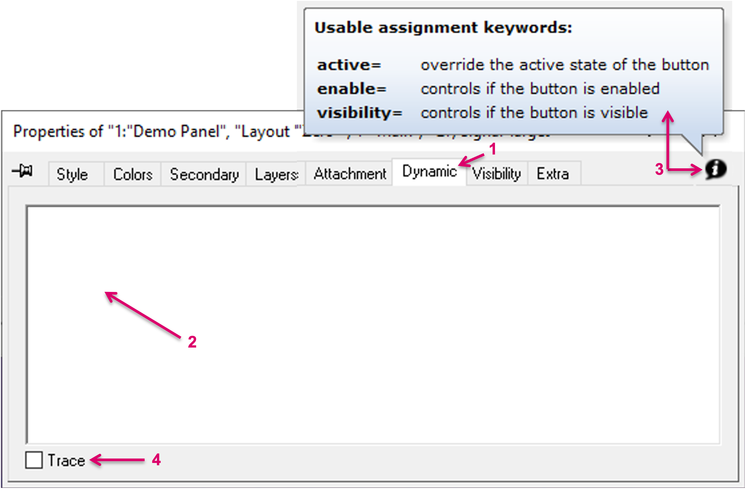
Dynamic
The free text field under tab Dynamic (1) allows to enter Dynamic Attachment Scripts. Dynamic Attachment Scripts (DAS) enhance the panel button configuration possibilities with the possibility to add dynamic behavior or conditional triggers. It is possible to enter one or multiple scripts (DAS), line by line. The so entered scripts are then executed from top to bottom, until a script with a true result ends the execution of the scripts. Dynamic attachments scripts are not case sensitive. The free text field is empty by default (2).
The initially assigned button function (Source/Target, Control, etc.) will be used and not be changed by an entered script. Therefore, the desired dynamic assignment must already be considered when choosing the button function. E.g., an Audio Gain parameter, would usually be assigned to a Control button, while a Signal path Target requires a Target button.
Simple example: Entering the text/script selectedtarget in the Dynamic window of a Target button will result in: Once a target is selected anywhere on the panel page where this button is located, the respective target will also dynamically appear on this button. By clicking the info icon in the top right corner of the Dynamic dialog (3), a few basic, usable assignment keywords are shown as example.
To validate and check an entered script and respective execution, it is possible to enable the option "Trace", in the left bottom corner of the Properties window (4). This checkbox enabled, the results of the script(s) will be shown in CommTrace.
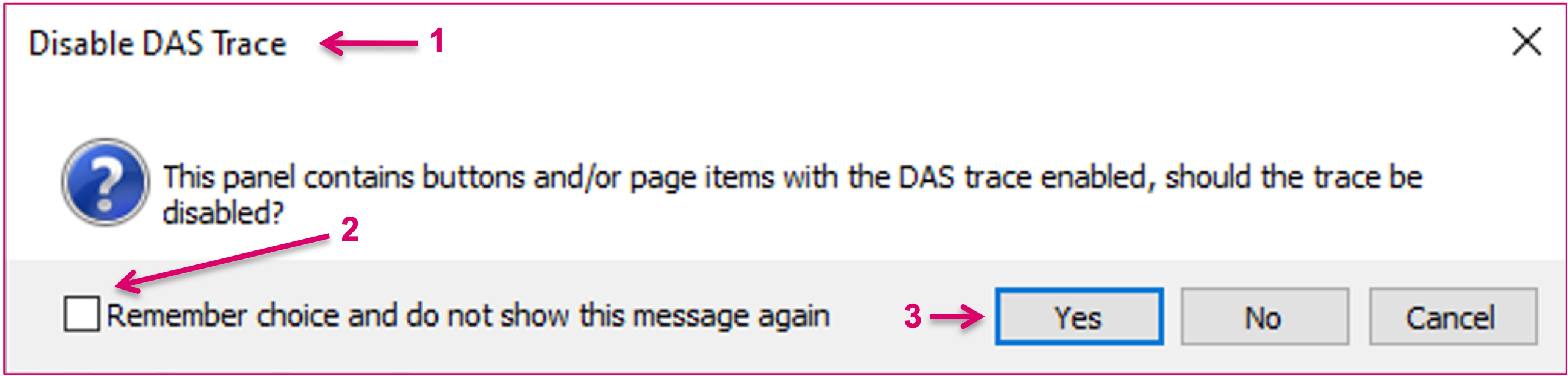
Remember to disable Trace once the script has been tested. Having two or more scripts tracing to CommTrace makes reading the output difficult and also has the potential of slowing down the system unnecessary.
While it is in general strongly recommended to disable the Trace option before closing the panel editor, the system will also remind the User with a pop up notification (1). The future appearance of this pop-up can be managed with the Remember choice option (2) before confirming the notification (3).
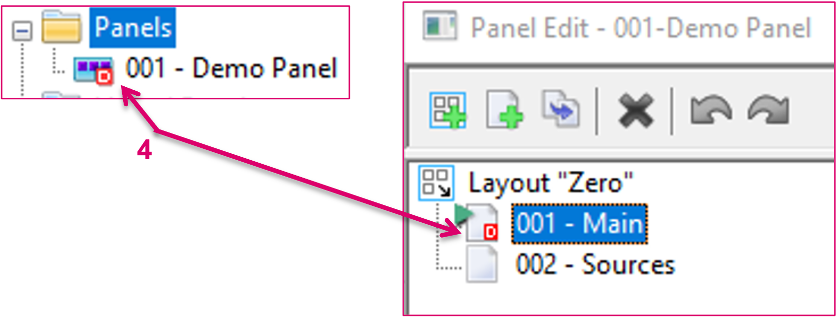
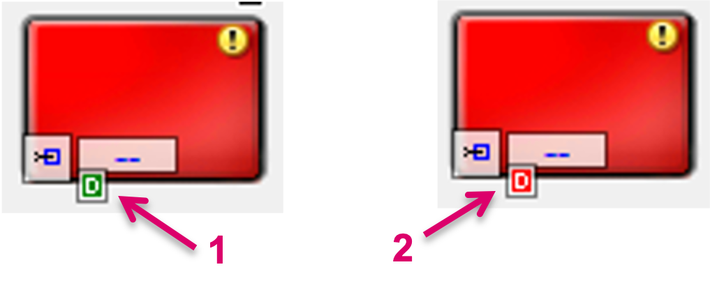
If Trace is enabled, this is indicated by a specific icon, D on red background, on the respective Panel entry in the Panel list, as well as on the respective page of this panel in the Editor view (4).
In the Editor view, an active DAS assignment on a button is indicated by a specific icon, D on green background, (1) and if Trace is enabled, this will be indicated also with the same icon on red background (2).
While the DAS feature in context of Panel configuration allows for extremely flexible and dynamic workflows, please refer to the separate documentation for Dynamic Attachment Scripts to learn more about the general usage of the DAS feature. This documentation includes also further insight on the possible interaction of Dynamic Attachment Scripts and Secondary commands.
Visibility
The Visibility tab offers different settings concerning the button display. 
Visible during "Normal" Operation is ticked by default and causes the button to be displayed. The option Visible during "Record" Operation affects storage groups (see Storage Groups). A crosspoint or a GPIO (see GPIOs) can be placed in the drop down menu beside Visibility is also controlled by. These will also influence the visibility of the button. The triangle symbol after the field indicates the logical connection. The standard view indicates that the button is displayed as soon as the assignment defined here is true. If the triangle has a black dot in its right tip, the button will be displayed of the assignment is false.
If the box in front of Hide when not active is ticked, the button will only be displayed when it is active.
Enabled during "Normal" Operation is ticked by default and is required so that the button can be operated. Enabled during "Record" Operation is also ticked by default. If it is deactivated, the button cannot be selected while a storage group (see Storage Groups) is recorded.
The drop down menu beside Enable is also controlled by allows the placing of a GPIO (see GPIOs) or a crosspoint which can also influences the availability of the button. The triangle symbol behind the field indicates the logical connection. The standard view indicates that the button will be displayed as soon as the predefined assignment is true. If a black dot is shown in the right bottom tip of the triangle, the button will be displayed if the assignment is false.
The option Don't "dim" the Button when disabled can be used to display the actual colour instead of the light gray used as default.
Extra
Additional functions can be assigned under the Extra tab.

- Deselect active Target: All currently selected sources, targets will be deselected.
- Deselect active Component: All currently selected gadgets will be deselected.
- Suppress TAKE for this target: Will ignore the Take button on the panel for this target.
- Suppress TAKE for this button: Will ignore the Take button on the panel for this source.
- Toggle with Previous Source: It is possible to switch back to the previous source by selecting the current source again.
- Execute when Pressed: The function will be triggered as soon as the button is pressed.